Category Archives: Uncategorized

2016 Population: Back to the Suburbs, Back to the Past

Today the Census released its 2016 population estimates for counties and metropolitan areas. I published a blogpost about these latest trends on FiveThirtyEight. Below is some additional analysis and extra charts.

Note that all data are population estimates for July 1 of the stated year. More information and the raw data are available at the Census Bureau’s website.

Cities, Suburbs, and Rural Areas

The fastest-growing counties in 2016 were the lower-density suburbs of large metros. Urban county growth slowed, and non-metropolitan counties lost population slightly.

place type 2016 vs 2010_2015

Although large metros continued to grow faster than mid-size and small metros, large-metro growth slowed.

metro size trend

Within large metros, lower-density suburbs grew fastest. Urban counties of large metros are growing more slowly than their suburbs, and urban county growth has been falling since 2011.

county type within large metro trend

Counties outside metropolitan areas have been losing population — except for those where at least 30% of adults have a bachelor’s degree. These educated rural areas are growing faster, and their growth is accelerating.

rural education

Dividing all counties into four quartiles by density, population growth in the top quartile — urban counties — has slowed while the bottom quartile — exurbs, small towns, and rural areas — has sped up.

county density quartile trend

Many counties encompass a variety of neighborhoods. More granular data at the Census tract level confirms that suburbs — particularly lower-density suburbs — are growing fastest. See here for more explanation.

neighborhood density 2015

Rankings: Fastest-Growing Metros

Among all metros, The Villages, FL, grew fastest last year.

top 10 all metros

The fastest-growing large metros were all in the South and West.

top 10 large metros

Cape Coral-Fort Myers was the fastest growing for the second year in a row. Austin was in the top spot for the previous four years.

top metro by year

Rankings: Slowest-Growing Metros

The metros with the steepest losses were smaller metros across the country.

bottom 10 all metros

The larger metros that lost population, however, were in the Northeast and Midwest. Seven of the ten with the largest losses were in eastern Ohio, upstate New York, and Pennsylvania.

bottom 10 large metros

For the seventh year in a row, Youngstown had the slowest growth among large metros. The only other metros in this spot since 2000 were Detroit during the Great Recession, San Jose during the dotcom bust, and New Orleans after Hurricane Katrina.

bottom metro by year

Domestic and International Migration

The three components of population change are domestic migration, international migration, and births and deaths. Domestic migration accounts for most of the differences in population growth both across places and over time.

The urban counties of large metros lose the most population due to domestic migration but gain the most from international migration. Non-metropolitan areas also lost population due to domestic migration; lower-density suburbs of large metros gained most from domestic migration.

place type migration dom vs intl

The metros where international migration contributes most to growth include big coastal metros like Miami, the San Francisco Bay Area including San Jose, and the northeast corridor of Boston, New York, and Washington.

top metros intl migration

The metros gaining the most from domestic migration are in Florida. None of the top metros for international migration are among the top metros for domestic migration.

top metros domestic migration

Of the top metros for international migration, only Orlando gains from domestic migration; the other nine lose people to other U.S. places. In fact, the correlation between domestic migration and international migration at the metro level is slightly negative.

migration scatter metros

Current Trends Look Back to the Past

The differences in population growth between different-size metros and urban and suburban counties are surprisingly stable over time. In the 1980s, 1990s, the 21st century, and in the past year, population growth has been fastest in the lower-density suburbs of large metros and slowest in non-metropolitan counties.

place type decades

The pattern of county population growth in 2016 looks more like the 1980-2000 population-growth pattern than any year since the housing bubble in the mid-2000s. (Excluding Louisiana removes the extreme population swings in many counties due to Hurricane Katrina.) The correlation across counties between population growth in 2016 versus 1980-2000 is 0.72 (population-weighted).

correlation trend

Ultimately this means that the fastest and slowing growing metros today are very similar to those in 1980-2000, before the recent housing bubble and bust. The correlation across metros between population growth in 2016 versus 1980-2000 is 0.80, as shown in the scatterplot below.

metro 2016 vs 20c

The Geography of the 2016 Vote

The 2016 presidential election was shocking and unprecedented in countless ways. Newly released county-level vote data reveal an election that was more polarized than any since at least 2000, though on many dimensions voting patterns were a continuation and acceleration of trends already underway, rather than a reversal.

This post focuses on relationships between the county-level vote and geographic and demographic variables, using county vote totals from Dave Leip’s Atlas of U.S. Presidential Elections (version 0.25, updated Thursday evening November 10). Those data are still preliminary and incomplete, may contain errors, and will be revised over the coming weeks. A companion post on FiveThirtyEight takes a deeper look at economic conditions and the 2016 vote.

The key county election variable is the margin, which equals the difference between the Democrat’s vote and the Republican’s vote, divided by the total of votes for all candidates including third-party candidates. All summary measures in this post are weighted by the county’s total vote count.

The 2016 election was the most geographically polarized election since 2000. (This blogpost looks only at election data from 2000, 2004, 2008, 2012, and 2016.) The standard deviation of the vote margin between the Democrat and the Republican was higher in 2016 than in previous years and has been increasing steadily. That means that the vote in a county was, on average, farther in one direction or the other from the national vote in 2016 than in previous years.

standard-deviation

How did the geographic patterns change? Voting aligned more tightly with both race and education in 2016 than in earlier years. The correlation between % of residents who are White (non-Hispanic) and the Republican margin was .69 in 2016; the correlation between % of adults with a bachelor’s degree and the Democrat margin was .56. While the correlation with the vote margin was higher for race than education in 2016, the increase relative to previous years was steeper for education than race.

vote-and-white


vote-and-education

The vote also skewed more strongly by population and density. The correlation between household density per square mile and the Democrat margin was .75, the highest since 2000, and accelerated in 2016. (Household density is a measure of urbanness.)

vote-and-density

Large metros tend to vote Democrat, while mid-size and small metros as well as non-metropolitan (largely rural) areas tend to vote Republican. Within large metros, however, lower-density suburbs tend to vote Republican. Between 2012 and 2016, the urban counties of large metros inched more toward blue, but small metros and non-metro areas became much more red. (Metro and density are explained in more detail at the end of this post.)

county-type-and-vote-margin-nov-11

Finally, the counties that swung more Republican in 2016 included many in the Midwest and central parts of the country that face economic challenges including slower growth. Whereas in previous elections counties with faster long-term population growth tended to vote Republican, that relationship essentially disappeared in 2016. This may turn out to be a silver lining for Democrats if more faster-growing counties increasingly lean blue.

vote-and-pop-growth

Some examples of counties and metros that flipped in 2016 provide color. The largest county that voted for Trump in 2016 after voting blue in 2000, 2004, 2008, and 2012 was Suffolk County, NY (the eastern part of Long Island). Orange County, CA (south of Los Angeles) went the other way, voting for Clinton in 2016 after voting red in previous years. These flips reflect both new political alignments as well as local demographic shifts.

Among metros, the largest to vote for Trump after voting blue in 2000-2012 were St. Louis; Youngstown, OH; Scranton, PA; Erie, PA; and Saginaw, MI. (Trump won the St. Louis metro by just a hair, so it’s possible that could change as additional data come in.) The only metro where Clinton led after voting red in 2000-2012 was Salt Lake City, where independent Evan McMullin got a notable share of the vote.

For the most part, though, blue America remains blue, and red America remains red. The correlation of the 2016 and 2012 margins across all counties was .96, as was the correlation of the 2008 and 2004 margins. (The 2008-2012 and 2000-2004 correlations were even higher, though each of those election pairs featured the same candidate for one of the parties.) Places that voted differently in 2016 than in 2012 or earlier elections are the exceptions. The country is increasingly politically polarized, and on most dimensions the polarization is accelerating. For all the ways in which 2016 was different, the geographic pattern of voting was an exaggeration, not a reversal, of trends already underway.


Will Your Job Disappear? Economic Anxiety, Demographics, and the Future of Work

White men, older adults, and the less educated are more likely work in occupations that are projected to shrink.

Americans say they are anxious about the economy. In the Gallup poll of economic confidence, Americans are more pessimistic than optimistic today, as they have been throughout nearly all of the economic recovery. Large threats loom. International trade — and the “China shock” in particular — has hurt jobs and wages in exposed industries and local markets. Robots are another worry, with estimates of the share of US jobs at risk of being automated ranging from 9% to 47%. Economic anxiety jumped around 2008, more for Whites than for Hispanics or African-Americans. In the presidential election campaign, Donald Trump’s call to “Make America Great Again” is, in part, an appeal to voters concerned about their economic future. (See note on data and methodology at end of post.)

race econ anxiety GSS for blogpost

But is this economic anxiety wholly justified? Although there are serious red flags — like low labor force participation among less-educated men and unemployment spells lasting longer — most economic indicators look upbeat. Payrolls have been expanding for years, the unemployment rate is back in pre-recession range (or at least getting closer, even for broader unemployment measures like U-6), and wage growth has improved. Although Hispanics and African-Americans, as well as younger adults generally, are doing worse economically — as measured by current unemployment, income, wealth, or the impact of the Great Recession — they are not the people who are most anxious about the economy nor are Trump’s strongest supporters, who tend to be Whiter and older. In fact, a recent analysis of Gallup polling data found that support for Trump was stronger among people with higher incomes, holding other factors constant, with “less strictly economic measures of social status” being better predictors of viewing Trump favorably.

Yet it turns out that the groups most anxious about the economy — and most in support of Trump — tend to be in jobs that are at greater risk of disappearing. White men, older adults, and the less educated are more likely than other groups to work in occupations that are projected to shrink.


The Most At-Risk Occupations

This debate over who should be anxious about the economy usually starts with income and unemployment rates. There’s no question: these are natural and essential measures of economic well-being. But these measures are not the whole story. Economic anxiety can also reflect expectations about the future, how the economy is changing, and whether one can adapt to those changes. Concerns about automation and globalization are particularly sharp because they reflect deep economic shifts, rather than temporary, cyclical swings. Jobs that get automated or competed away might never come back, and workers who once held those jobs might find their skills have become obsolete. Furthermore, since occupations are often clustered geographically, workers in at-risk occupations might worry not only about their own prospects but also about their neighbors, friends, customers, and home values. People who work in occupations that might fade or disappear would understandably be anxious about the economy.

Which jobs are most at risk? The Bureau of Labor Statistics (BLS) makes projections about employment changes over the next ten years, covering hundreds of specific occupations across all broad categories. Among broad categories, BLS expects job losses in production (that is, manufacturing) and farming, forestry, and fishing jobs between 2014 and 2024, whereas the fastest growing categories are health-care related.

Not all shrinking occupations are blue-collar jobs: the economy is changing in ways that go well beyond “the end of brawn.” Many service-sector occupations are projected to shrink: the BLS predicts big drops in employment for bookkeepers and accountants, fast food cooks, and mail carriers, for example. In fact, because manufacturing and agricultural employment as a share of the overall job market have plummeted in past decades, most of the shrinking occupations are now service jobs: 57% of the jobs in shrinking occupations are in services, while just 33% are production and repair jobs and 9% are in farming, fishing, or hunting. Furthermore, occupations expected to shrink include some high-paying jobs like nuclear technicians, air traffic controllers, and, perhaps surprisingly, computer programmers (though other computer-related occupations, like software developers, database administrators, and network architects, are expected to grow).


Which Demographic Groups Are in Shrinking Occupations?

By matching BLS projections for each occupation with Census data on individuals’ occupations and demographics, we can see which demographic groups are more likely have jobs in occupations that are projected to shrink. Nationally, 10.7% of adults are in shrinking occupations, but that share is higher for some demographic groups than for others.

The share of workers in shrinking occupations is higher for adults with less education: just 6.0% for those with a graduate degree compared with 12.3% for those with only a high school degree and those without a high school degree. Having more education is also associated with higher income and lower unemployment, so educational attainment is related to favorable outcomes on all of these measures.

demographics education

For age, unlike for education, those most likely to work in shrinking occupations are NOT the groups with higher unemployment and lower incomes. Older adults are more likely to be in shrinking occupations than younger adults — 12.6% for 55-64 year-olds versus 9.3% for 25-34 year-olds — despite younger adults generally having higher unemployment rates and lower incomes than older working-age adults.

demographics age

For sex and race and ethnicity, the story is more complicated. Men are more likely to be in shrinking occupations than women (11.9% for men, 9.5% for women), but on other employment measures — like pay — men do better. Add in race and ethnicity, and the group most likely to be in shrinking occupations is White men, slightly ahead of Hispanic men, though the difference is not statistically significant. (The t-value for the difference between White men and Hispanic men is 1.54. Combining sexes, the share in shrinking occupations is higher for Hispanics than for Whites.) African-Americans are the least likely to be in shrinking occupations.

demographics race sex

Excluding farming, forestry, and fishing jobs — which are projected to shrink and are disproportionately Hispanic — the share of workers in shrinking occupations is highest for White men, by a statistically significant margin, and lowest for African-American and Hispanic women. (Combining sexes, the share in shrinking occupations is highest for Whites when farming, fishing, and forestry jobs are excluded. The difference between Whites and Asians is small but statistically significant.)

demographics race sex x ag

Therefore, even though Whites and Asians have both higher incomes and lower unemployment than African-Americans and Hispanics, and White men are overrepresented in positions of power and privilege — sometimes vastly so — in most fields, White men are disproportionately likely to be in shrinking occupations. Among White men who are older (55-plus) and less educated (high school degree or less), 15.3% are in occupations projected to shrink, which is 42% above the national average of 10.7%.

Does this all mean that women, young adults, and African-Americans are all doing better in the labor market than men, older adults, and Whites because they’re less likely to work in shrinking occupations? Of course not: income, wealth, and having a job today are critical for economic well-being, and on these measures African-Americans and Hispanics are, on average, behind.

The point is that economic anxiety could arise for many reasons. No single measure gives the full picture of economic anxiety. Those who are better off by straightforward measures of average income or unemployment rates may be in occupations more likely to shrink. Economic anxiety is more understandable and justified – and deserves to be taken more seriously – when we consider the possibility and consequences that occupations can shrink and, eventually, even disappear.


Data and Methodology

This analysis draws primarily on two datasets: the Bureau of Labor Statistics’ (BLS) Occupational Employment Projections for 2014-2024 (published in December 2015), and the Census Bureau’s American Community Survey (ACS) Public Use Microdata Sample for 2012, 2013, and 2014. Occupation-level projections from BLS were matched with individuals’ occupations in the ACS. To create a consistent set of occupational categories, some occupations in the BLS projections were combined. ACS data were downloaded at IPUMS-USA, University of Minnesota, www.ipums.org.

More information about the General Social Survey (GSS) is here. The Hispanic sample of the GSS changed in 2006. Differences in economic anxiety between Whites and other groups are statistically significant starting in 2008. A separate regression analysis using GSS data revealed that working in a shrinking occupation is negatively correlated with the expectation that standard of living will improve, even when controlling for age, race/ethnicity, sex, education, income, and nativity; the effect is statistically significant.

Throughout this post, racial and ethnic categories are defined to be mutually exclusive, so that Whites, African-Americans, and Asians are non-Hispanics only. These categories were recoded from the original Census data, which asks about Hispanic ethnicity separately from race, such that Hispanics can identify as any race. Asians include Pacific Islanders.

Urban Revival? Not For Most Americans

The U.S. population is now less urban than before the start of the housing bubble. While well-educated, higher-income young adults have become much more likely to live in dense urban neighborhoods, most demographic groups have been left out of the urban revival.

In recent years, numerous studies and media reports have documented that college-educated young adults have been drawn to urban centers. At times some have claimed a broader demographic reversal in which cities grow faster than suburbs, and even the end of the suburbs.

But, in fact, the U.S. continues to suburbanize. The share of Americans living in urban neighborhoods dropped by 7%, from 21.7% in 2000 to 20.1% in 2014. Even looking at only the densest urban neighborhoods where about one-third of the urban population lives, the share of Americans living in these neighborhoods fell by 5%, from 7.4% in 2000 to 7.0% in 2014. (See note at end of post for details on data, methodology, and definitions.) Headlines about educated young adults flocking to Brooklyn and San Francisco aren’t wrong – but they are far from the whole story and are unrepresentative of broader trends. Other demographic groups are suburbanizing faster than the young and rich are piling in to cities.

This post looks at the change in urban living for detailed demographic groups, using individual-level data from the Census. The findings are consistent with analyses of the most recent county data and of detailed neighborhood data, both of which confirm that the American population overall continues to suburbanize. What’s new is that individual-level data show us how skewed the urban revival is toward rich, young, educated Whites without school-age kids.

People Aren’t Urbanizing, But Money Is

Urban neighborhoods – especially higher-density urban neighborhoods – grew richer between 2000 and 2014. But only higher-income households became more urban over these years. The poorest tenth of households was 12% less likely to live in urban neighborhoods in 2014 compared with 2000, and 17% less likely to live in higher-density urban neighborhoods. In contrast, the richest tenth of households was 12% more likely to live in higher-density urban neighborhoods, and only 1% less urban overall in 2014 than in 2000. The top four income deciles were all more likely to live in higher-density neighborhoods in 2014 than 2000, while none of the bottom six were.

income deciles

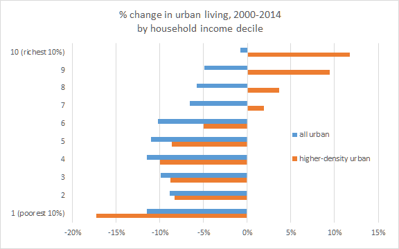
The suburbanization of the poor and urbanization of the rich was enough to raise the share of total household income going to higher-density urban neighborhoods. Although the share of the total population living in higher-density urban neighborhoods fell by 5% between 2000 and 2014, as noted above, the share of total national household income received by households in higher-density urban neighborhoods rose by 6%.

Urban Neighborhoods Are Increasingly Young, Rich, Childless*, and White

Cities have gotten younger since 2000. But that’s not because Millennials – those age 18-33 in 2014 — are an especially urban generation.

The only age group that has become more urban since 2000 is 35-39 year-olds, who in 2014 were 2% more likely to live in urban neighborhoods and 9% more likely to live in higher-density urban neighborhoods. (In addition, 40-44 year-olds are ever so slightly more likely to live in urban neighborhoods, by 0.1%.)

age

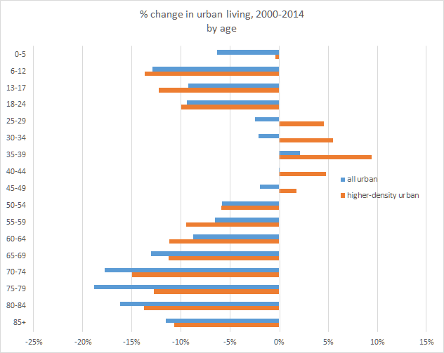
While older Millennials (roughly, the 25-29 and 30-34 age groups) are more likely to live in higher-density urban neighborhoods, younger Millennials – age 18-24 – are 9% less likely to live in an urban neighborhood and 10% less likely to live in a higher-density urban neighborhood in 2014 than in 2000. Since many 18-24 year-olds live in college dormitories and even more live with their parents, we can look at only those 18-24 year-olds who are not in school and not living with relatives. The answer is similar: fewer lived in urban (or higher-density urban) neighborhoods in 2014 than in 2000, though the decline is less steep than when all 18-24 year-olds are included.

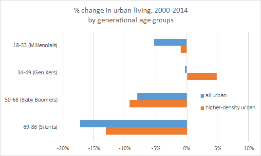
In fact, among the four main generations as commonly defined, only Gen Xers were more likely to live in higher-density urban neighborhoods in 2014 than their same age group was in 2000.

generations

Let’s focus on the 25-49 year-olds, which includes all of the age groups more likely to live in higher-density urban neighborhoods in 2014 than in 2000. Even within this group, the trend toward urban living is limited to those with college degrees, and those without school-age children. Within this age group, people with four or more years of college were 5% more likely to live in urban neighborhoods in 2014 than in 2000, and 17% more likely to live in higher-density urban neighborhoods – a big increase. But only one-third of adults 25-49 have four or more years of college. The other two-thirds, including those with no college at all, became less urban over this period.

young extras

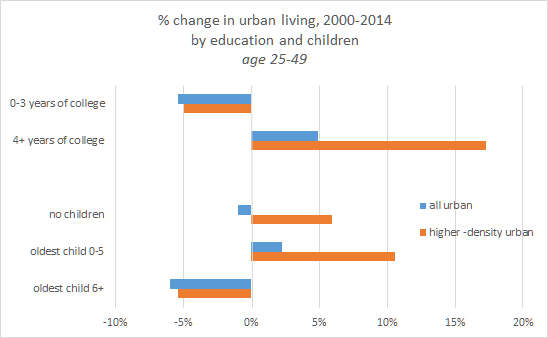
The urban revival has also left out adults with school-age kids. 25-49 year-olds with a child age six or older were 6% less likely to live in urban neighborhoods (5% less likely in higher-density urban neighborhoods). Even among 25-49 year-olds with four or more years of college, those with kids age six or older were 6% less likely to live in urban neighborhoods in 2014 compared with 2000, and only a bit more likely (2%) to live in higher-density urban neighborhoods. Another way to see this is that the school-age kids themselves — 6-12 and 13-17 year-olds — were less urban in 2014 than in 2000, as the earlier chart shows.

Two final points reinforce that we can’t generalize about young people becoming more urban. The 25-49 year-olds in the bottom tenth of the overall income distribution were 18% less likely to live in urban neighborhoods and 27% less likely to live in higher-density urban neighborhoods in 2014 than in 2000. In contrast, 25-49 year-olds in the top tenth of the income distribution were 11% more likely to live in urban neighborhoods and a whopping 33% more likely to live in higher-density urban neighborhoods in 2014 than in 2000.

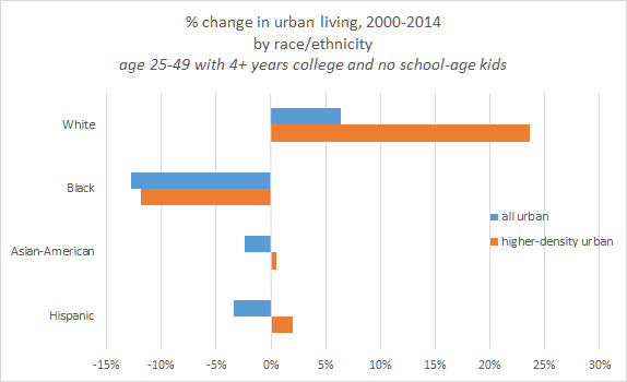
Lastly, the urban revival is overwhelmingly about Whites, even after accounting for racial and ethnic differences in education and presence of children. Among 25-49 year-olds with four or more years of college and no school-age kids, Blacks, Hispanics, and Asian-Americans were all less likely to live in urban neighborhoods in 2014 than in 2000, unlike Whites. The share of Blacks living in higher-density neighborhoods dropped 12%, and rose just 2% for Hispanics and 0.5% for Asian-Americans, compared with an increase of 24% for Whites. It remains the case that young, educated Whites without school-age kids were still less likely to live in urban or higher-density urban neighborhoods than other races and ethnicities in 2014, but the trend since 2000 has been radically different for Whites than for the other major racial and ethnic groups.

young race

Seniors Aren’t Returning to Cities

While the urbanization trends for young adults depend on which young adults we’re talking about, the pattern is more straightforward for older adults. The senior population has become significantly less urban. All age groups 65 and older were at least 10% less likely to live in urban neighborhoods in 2014 than in 2000; that’s true for the high-density urban neighborhoods, too. Unlike young adults, the decline in urban living among older adults is similar for those with and without college degrees. And, unlike for young adults, the decline in urban living among older adults is generally steeper for those with higher incomes.

Furthermore, it is not simply that older adults are staying in their suburban homes longer, held back by negative equity or other fallout from the housing bubble. Even among only those 65-79 year olds who have lived in their current home less than two years, the share living in urban neighborhoods dropped by 12% (and by 16% for higher-density urban neighborhoods). Nor is it that older adults are hanging onto suburban homes because their kids are living in the basement: the decline in urban living is similar among only those adults age 65-79 who live in one- or two-person households with no children of any age (including adult children).

Prior to the trends of the 2000s, older adults were already less likely than younger adults to live in urban areas. Therefore, the least urban age groups have become yet less urban. Even those who have recently moved and those who are in the position to afford expensive urban housing are increasingly living outside of urban neighborhoods.

How Many Cheers for the Urban Revival?

If the trend toward urban living is limited to some educated, young adults, why has the urban comeback gotten so much attention? It probably doesn’t hurt that many of the people writing these stories are themselves educated, young adults in dense urban neighborhoods. More seriously, though, educated, young adults are highly mobile and have disposable income, so their choices about where to live can be a strong leading indicator about broader shifts in the desire for urban living. Also, young, talented workers boost local economic innovation and productivity, especially when they – as economists like to say – agglomerate. And it’s not just those urban areas themselves that benefit. The increased clustering of talented people in productive places boosts national economic output. Plus, upscale stores and restaurants serving new urban residents are a draw for suburbanites and tourists, too. Little wonder that the urbanization of the young and educated has been celebrated.

But enthusiasm for the urban revival should be tempered by a recognition that most of America is not directly taking part. Both the poor, who traditionally have depended most on urban public services, and seniors, by far America’s fastest-growing age group, have become less urban as the young and educated have moved in. And some of the talented, educated people who would boost cities’ fortunes aren’t urbanizing much or at all, such as people with school-age kids, non-White young adults, and Baby Boomers who are nowhere near retirement. Among the majority of the population that’s becoming less urban, some might have chosen suburbs and rural areas because those places are a better fit for their needs than urban areas are. Others might have preferred to stay urban but have been outbid for housing by the young and educated, particularly in cities where onerous regulations and permitting processes have limited new construction.

To be sure, the dramatic increase in higher-density urban living among the young and educated is a strong vote in favor of life in America’s most successful cities, and it has brought disproportionately large economic benefits. Still, a three-cheer urban revival would be one in which more than just the young and educated would increasingly both want and be able to live in dense, urban neighborhoods.


Notes:

All data in this post are based on Public Use Microdata Samples (PUMS) from the 2000 decennial Census and 2014 one-year American Community Survey (ACS). PUMS files are individual-level data, which makes it possible to create custom classifications, such as 25-49 year-olds with four or more years of college and no school-age kids.

The most granular level of geography available in the PUMS file is Public Use Microdata Areas (PUMAs), each representing a little over 100,000 people. (Analyses using aggregate data can use finer geographies like ZIP codes, but with aggregate data one cannot construct custom demographic groups. Also, aggregate small-geography data is available only as 5-year averages; the latest available, the 2010-2014 5-year ACS, averages in less recent data than one can see at the PUMA level in the 2014 one-year PUMS file.)

I classified PUMAs as urban and higher-density urban based on their tract-weighted household density, which equals the average households per square mile in each Census tract within a PUMA, weighted by the number of households in the tract, according to the most recent full-count Census. PUMA definitions change over time. Therefore, the urban classification for the 2000 decennial Census sample uses PUMAs defined in 2000 and density calculated using 2000 Census household counts; the urban classification for the 2014 ACS sample uses PUMAs defined in 2012 and density calculated using 2010 Census household counts.

Urban PUMAs are those with tract-weighted density of at least 2,213 households per square mile, which is the cutoff above which, according to survey research, Americans consider their neighborhood to be urban. The cutoff for higher-density urban neighborhoods was set at 5,000 households per square mile and corresponds to the densest one-third of all urban neighborhoods. These higher-density urban PUMAs include most parts of the cities of New York, Chicago, Philadelphia, San Francisco, Boston, Washington DC, Honolulu, and Miami; downtown portions of many other big cities; and a few dense places outside of big cities, like Arlington, VA; Berkeley, CA; and Jersey City, NJ. At significantly higher cutoffs for higher-density, the set of higher-density urban PUMAs shrinks quickly and becomes dominated by neighborhoods in New York City. Nineteen of the twenty densest PUMAs in America are in New York City; all of the top ten are in Manhattan.

The analysis focuses on the change over the period 2000 to 2014. It starts in 2000 and not later in order to highlight what are more likely to be sustained shifts in living patterns. The years between 2000 and 2014 saw the extreme cycle of the bubble, bust, and recovery: the bubble years favored suburban growth, and the bust and recovery years have been, in part, a reaction and correction to the bubble. Analyses of urban and suburban patterns that cover only part of the full cycle back to 2000 risk being dominated by cyclical swings that obscure the underlying trends.

The race and ethnicity categories include those who reported one race. Two or more races, and other races, are not shown in the table. The White, Black, and Asian-American categories exclude Hispanics, who are shown as a separate category.

All data in this post were downloaded from IPUMS, which requests to be cited as: Steven Ruggles, Katie Genadek, Ronald Goeken, Josiah Grover, and Matthew Sobek. Integrated Public Use Microdata Series: Version 6.0 [Machine-readable database]. Minneapolis: University of Minnesota, 2015.

Neighborhood Data Show That U.S. Suburbanization Continues (Wonkish)

In yesterday’s post, I used newly released Census population estimates for 2015 to show that suburban counties are growing faster than urban counties, and by a widening margin. In that post I noted that “… many counties, especially large counties, include both urban and suburban neighborhoods. …  Other data sources with greater geographic detail confirm that population growth is generally faster in suburban than urban neighborhoods, though not uniformly.” This follow-up post provides a closer look at trends in where Americans live, using much more detailed neighborhood data.

To track the trend in urban versus suburban (and rural) living, I looked at the share of U.S. households that live in Census tracts with different densities. For 1990, 2000, and 2010, I calculated the density, in households per square mile, in each Census tract, from the full-count decennial Census. (Neighborhood density is the best predictor of whether someone describes where they live as urban, suburban, or rural. An alternative method is to look at distance from the city center, but I like that measure less: for instance, three miles in one direction from downtown might be a lot more urban than three miles in the other direction; also, some metros are much more urban than others – which means, for instance, three miles from midtown Manhattan is much more urban than two miles from downtown Charlotte.)

In previous work, I showed that people in neighborhoods with at least 2,213 households per square mile typically consider their neighborhood to be urban; neighborhood density of 102-2,213 is perceived to be suburban, and less than 102 is rural.  Accordingly, I divided Census tracts into categories at those density breakpoints, and then added a few arbitrary breakpoints for additional granularity, for a total of eight categories.

Then, for each Census year, I calculated the percentage of households living in each density category for the U.S. overall. In addition to 1990, 2000, and 2010, I used tract-level household estimates from the 2014 five-year American Community Survey as a more recent datapoint, though the ACS counts are estimates and reflect an average of the five years from 2010 to 2014, whereas the decennial Census data are full household counts at a single point in time. (For the 2014 ACS estimates, I used tract densities calculated from the 2010 decennial Census.)

Here’s the punchline: Americans are getting more suburban, less urban, and less rural. The share of households in urban neighborhoods declined in the 1990s, 2000s, and 2010s to date. This is true whether we group all urban neighborhoods together (that is, all categories with density of 2,213 or more), or look just at the highest-density urban neighborhoods: the share of households in Census tracts with at least 10,000 households per square mile has declined, slightly but consistently, from 4.0% in 1990 to 3.9% in 2000, 3.8% in 2010, and 3.7% in 2014. Rural neighborhoods have also had a declining share of population, too. But suburban neighborhoods have all gained population share over the entire time period, with the exception of the higher-density suburban neighborhoods (1,500-2,212 households per square mile) in the most recent years (2010-2014). (Note that the % of households in each category reflects the breakpoints, some of which are arbitrary — what matters is the TREND in the % of households in each category.)

neighborhood density

Time for all the usual caveats. First: this analysis shows the broad national trend, but there are always some places – specific neighborhoods or even metros overall – that buck the national trend. Second: the composition of neighborhoods matters, not just the total number of people who live there. Some demographic groups – such as young adults with college degrees – have indeed become more urban. That group has been important in shaping a narrative about urbanization, but they are the exception, not the norm. Third: where people live isn’t necessarily what they “want.” The cost and availability of housing matter, too, which in turn is shaped by land-use regulations, housing subsidies, and other public policies. Suburban population growth, by itself, doesn’t prove that demand for suburban living is increasing — just as rising urban prices, by themselves, don’t prove that demand for urban living is increasing. And, fourth: from a policy perspective, it doesn’t matter so much whether cities are winning. Public policies that affect location decisions (like the mortgage interest deduction, or parking policies) should be based on externalities that arise from where people live, not on trends in where people are moving.

With those caveats, the main point is that America is becoming more suburban. Both up-to-date annual county population estimates (yesterday’s post) and neighborhood data that’s less current and less frequent (this post) show that same trend. While it is important to remember that, in theory, county-level analysis could give a misleading picture of overall urban and suburban population trends, it is also important to know that, in fact, it does not.

2015 Population Winners: The Suburbs and the Sunbelt

Local population growth trends are reverting to pre-2000 patterns as the housing bubble and its aftermath recede.

Today the Census Bureau released its 2015 population estimates for counties and metropolitan areas. After volatile swings in growth patterns during last decade’s housing bubble and bust, long-term trends are reasserting themselves. Population is growing faster in the South and West than in the Northeast and Midwest, and faster in suburban areas than in urban counties; both of these trends accelerated in 2015. Before getting deeper into these broad patterns, though, let’s start with the metros that saw the fastest growth and steepest declines in the past year.

Top Metro Winners and Losers

The Villages – a small metropolitan area near Orlando with lots of retirees – led all metros in population growth. Six of the ten fastest growing metros in 2015 were in Florida and Texas, while none were in the Midwest or Northeast.

Metros with the Fastest Population Growth
# Metro YoY population change, 2014-2015
1 The Villages, FL 4.3%
2 Myrtle Beach-Conway-North Myrtle Beach, SC-NC 3.5%
3 Cape Coral-Fort Myers, FL 3.3%
4 Midland, TX 3.3%
5 Odessa, TX 3.3%
6 Greeley, CO 3.2%
7 Austin-Round Rock, TX 3.0%
8 Bend-Redmond, OR 2.9%
9 Punta Gorda, FL 2.8%
10 Fort Collins, CO 2.7%
Among all metropolitan areas

Among large metros, Cape Coral – Fort Myers and Austin had the fastest growth. All of the fastest-growing large metros were in the South and West.

Large Metros with the Fastest Population Growth
# Metro YoY population change, 2014-2015
1 Cape Coral-Fort Myers, FL 3.3%
2 Austin-Round Rock, TX 3.0%
3 North Port-Sarasota-Bradenton, FL 2.7%
4 Orlando-Kissimmee-Sanford, FL 2.6%
5 Raleigh, NC 2.5%
6 Houston-The Woodlands-Sugar Land, TX 2.4%
7 Charleston-North Charleston, SC 2.4%
8 Provo-Orem, UT 2.4%
9 Lakeland-Winter Haven, FL 2.3%
10 Las Vegas-Henderson-Paradise, NV 2.2%
Among metropolitan areas with at least 500,000 people

Population growth in these metros was driven more by domestic migration than by international migration or “natural increase” (that is, births and deaths). All ten of the fastest-growing large metros had more in-migrants from the rest of the country than out-migrants. However, natural increase boosted population growth in metros with lots of young adults of child-bearing age (e.g. Provo-Orem UT) but was a drag on growth in metros with older populations (such as Cape Coral – Fort Myers and North Port – Sarasota – Bradenton). And among the large metros with the highest growth rate from international migration (Miami, San Jose, New York, Honolulu, Orlando, and Washington DC), only Orlando also had positive net domestic migration and therefore strong overall population growth. (Among all metros, the correlation between overall population growth and net domestic migration was 0.86; the correlation between overall population growth and natural increase was 0.40, and the correlation between overall population growth and international migration was just 0.19.)

Note the presence of oil towns on these lists. Houston was among the ten fastest growing large metros, and Midland and Odessa, TX, were among the fastest growing of all metros. Two other places with an energy boom – Williston and Dickinson, ND, were the fastest-growing “micropolitan” areas in the country. These Census population estimates are as of July 1 of each year, so the 2015 data are actually a snapshot from almost nine months ago. It’s highly likely that population growth has slowed in energy-producing areas since July 2015: more recent jobs data have shown that falling oil prices hurt energy-sector employment.

One last point about the fastest-growing metros: 2015 is the first year since 2010 when Austin was not in the top spot among large metros. Cape Coral – Fort Myers, which bumped Austin out in 2015, was also the leader in the bubble years of 2004-2006.

Metro with the Fastest Population Growth, by Year
Year Metro
2001 Las Vegas-Henderson-Paradise, NV
2002 Las Vegas-Henderson-Paradise, NV
2003 Las Vegas-Henderson-Paradise, NV
2004 Cape Coral-Fort Myers, FL
2005 Cape Coral-Fort Myers, FL
2006 Cape Coral-Fort Myers, FL
2007 New Orleans-Metairie, LA
2008 Raleigh, NC
2009 Provo-Orem, UT
2010 Colorado Springs, CO
2011 Austin-Round Rock, TX
2012 Austin-Round Rock, TX
2013 Austin-Round Rock, TX
2014 Austin-Round Rock, TX
2015 Cape Coral-Fort Myers, FL
Among metropolitan areas with at least 500,000 people

Now for the other extreme. Of the 381 metropolitan areas, 96 lost population in 2015 while 285 gained. Those with the steepest declines were all smaller metros, including several with military bases, spanning most regions of the country except the far West.

Metros with the Steepest Population Decline
# Metro YoY population change, 2014-2015
1 Farmington, NM -4.2%
2 Hinesville, GA -2.6%
3 Elizabethtown-Fort Knox, KY -2.2%
4 Pine Bluff, AR -1.1%
5 Watertown-Fort Drum, NY -1.1%
6 Decatur, IL -1.0%
7 Charleston, WV -1.0%
8 Albany, GA -1.0%
9 Saginaw, MI -0.9%
10 Wichita Falls, TX -0.9%
Among all metropolitan areas

Among larger metros, 13 lost population in 2015 while 91 gained. The ten with the steepest declines were all in Ohio, Pennsylvania, upstate New York, and Connecticut.

Large Metros with the Steepest Population Declines
# Metro YoY population change, 2014-2015
1 Youngstown-Warren-Boardman, OH-PA -0.7%
2 Scranton–Wilkes-Barre–Hazleton, PA -0.3%
3 Pittsburgh, PA -0.2%
4 New Haven-Milford, CT -0.2%
5 Syracuse, NY -0.2%
6 Rochester, NY -0.2%
7 Cleveland-Elyria, OH -0.2%
8 Hartford-West Hartford-East Hartford, CT -0.2%
9 Toledo, OH -0.1%
10 Buffalo-Cheektowaga-Niagara Falls, NY -0.1%
Among metropolitan areas with at least 500,000 people

Youngstown had the sharpest losses among large metros for the past six years and for 11 of the past 15 years. Metro Detroit had the biggest losses in 2008 and 2009; in 2015 Detroit was 14th from the bottom among large metros, with a growth rate of just 0.01%.  New Orleans had the steepest population decline of all large metros in 2006 thanks to Hurricane Katrina (the 2006 data reflects the year leading up to July 1, 2006, which includes when Katrina hit in August 2005). The early 2000s tech bust put San Jose at the bottom in 2002.

Metro with the Steepest Population Decline, by Year
Year Metro
2001 Youngstown-Warren-Boardman, OH-PA
2002 San Jose-Sunnyvale-Santa Clara, CA
2003 Youngstown-Warren-Boardman, OH-PA
2004 Youngstown-Warren-Boardman, OH-PA
2005 Youngstown-Warren-Boardman, OH-PA
2006 New Orleans-Metairie, LA
2007 Youngstown-Warren-Boardman, OH-PA
2008 Detroit-Warren-Dearborn, MI
2009 Detroit-Warren-Dearborn, MI
2010 Youngstown-Warren-Boardman, OH-PA
2011 Youngstown-Warren-Boardman, OH-PA
2012 Youngstown-Warren-Boardman, OH-PA
2013 Youngstown-Warren-Boardman, OH-PA
2014 Youngstown-Warren-Boardman, OH-PA
2015 Youngstown-Warren-Boardman, OH-PA
Among metropolitan areas with at least 500,000 people


Population Trends Favor the Sunbelt and the Suburbs

The lists of the fastest and slowing growing metros hint at general patterns in recent population growth. Looking at all counties in the U.S. – not just those in metropolitan areas – reveals three trends.

The first is the accelerating shift of population toward the Sunbelt. Among the four Census regions, the South and West both had population growth of 1.2% in 2015, far ahead of the 0.2% growth in both the Northeast and Midwest. Population growth in the South and West has outpaced that in the Northeast and the Midwest for decades, as well as in each year since 2000 throughout the housing bubble, bust, and recovery. The gap narrowed somewhat after the bubble burst, as population growth quickened in the Northeast between 2008 and 2012. Since 2013, however, population growth in the South and West has accelerated, while growth in the Northeast and Midwest has slowed – thus widening the gap between those two Sunbelt regions and the rest of the country.

four regions

The second trend is the recent slowdown in population growth in urban counties (defined as those with tract-weighted density of at least 2000 households per square mile). Both higher-density suburban counties and lower-density suburban counties had faster population growth than urban counties in 2015, and the gap between suburban and urban county growth was larger in 2015 than in 2014. In short, suburbanization accelerated in 2015.

While population growth in urban counties has clearly recovered from the housing bubble, during which urban counties lagged for many years and even lost population in 2006, the rebound in urban population growth was brief. Urban counties outpaced all other areas only in 2011, and urban growth in 2015 slowed to its lowest level since 2007.

Growth in small towns & rural areas – the lowest-density counties – remained behind that of urban, higher-density suburban, and lower-density suburban counties in 2015, even though small towns & rural areas grew in 2015 at the fastest pace since 2010.

Keep in mind that many counties, especially large counties, include both urban and suburban neighborhoods. The Census will release sub-county population estimates for 2015 later this year. Other data sources with greater geographic detail confirm that population growth is generally faster in suburban than urban neighborhoods, though not uniformly: for instance, high-density downtowns have grown faster than moderately dense suburban neighborhoods though slower than the lowest-density suburbs.

county density quartiles

The third trend is that metropolitan areas with at least one million people grew faster in 2015 than midsize and smaller metros did, just as in every year since 2008. While this is a reversal of the bubble years in the early 2000s, when midsize metros grew faster, it is a return to the pre-bubble pattern: in the 1980s and 1990s, as in the post-2008 period, population growth was faster in million-plus metros than in midsize metros, smaller metros, and non-metropolitan areas. (Micropolitan areas counted as metros in this analysis.)

metro population

It might seem surprising that urban counties are growing more slowly than suburban counties even though larger metros are outpacing smaller metros: after all, the most urban counties in America are in the large metropolitan areas of New York, Boston, Washington DC, and San Francisco. In fact, though, there’s no contradiction. Even the largest metropolitan areas typically include both urban and suburban counties. Most of the fastest-growing counties in America are suburbs in large Sunbelt metropolitan areas. Of the six counties (among those with at least 50,000 people) where population grew at least 4% in 2015, five are suburbs of large Sunbelt metros: Hays county (in Austin metro), Broomfield (Denver), Comal (San Antonio), Fort Bend (Houston), and Forsyth (Atlanta). (The sixth is Sumter FL, the county that constitutes The Villages metropolitan area.)


The Longer View: Population Trends Are Getting Back to Old Patterns

Since 2000 population trends have reflected the housing boom, bust, and recovery. The boom, lasting until 2006, favored the suburbs, where most new single-family homes were built (or overbuilt). Then, in the housing bust, patterns reversed, with urban counties and large metros rebounding while suburban and rural growth slowed. Now, as the recovery continues, old patterns – from before the 2000s – are returning.

For starters, compare population growth in metros by the severity of their local housing bust. In the hardest-hit metros, where prices climbed during the bubble and then fell 30% or more, population growth slowed dramatically from 2006 to 2009. Note that population in these metros started to slow before the bubble reached its height in 2006, as rising prices hurt affordability, and continued when the bubble burst as people lost their homes and local job markets suffered. In contrast, in metros with a relatively mild housing bust (price declines of 15% or less), population growth accelerated in 2007-2009: their economies held up better in the recession than the hardest-hit metros did. But since 2011, the metros with the severest housing bust have once again had the fastest population growth, and their lead over metros that had a moderate or mild bust has grown. Lower housing prices and stabilized local economies have attracted people back to metros that suffered the worst. In five of the ten large metros with the fastest population growth in 2015 (the four Florida metros plus Las Vegas, as shown above) home prices fell more than 45% in the housing bust.

housing bust severity

But it’s not just that population growth patterns today more like they did during early years of the bubble. Rather, local population growth trends increasingly look like they did before the bubble, in the 1980s and 1990s.

To see this, compare the list of the ten fastest-growing large metros in 2015 (shown at the top of this post) with the ten fastest-growing metros over the twenty-year period from 1980 to 2000. Five of the top ten in 2015 were also in the top ten in 1980-2000, including Cape Coral – Fort Myers, Austin, Orlando, Raleigh, and Las Vegas. Another four of the top ten in 2015 were in the top third in 1980-2000: North Port – Sarasota – Bradenton, Houston, Provo – Orem, and Lakeland – Winter Haven. Only Charleston SC was in the top ten in 2015 but had just middling growth from 1980 to 2000. On the flip side, seven of the ten steepest declining metros in 2015 were also among the bottom ten in 1980-2000; the other three in the bottom ten in 2015 were in the bottom twenty in 1980-2000.

Put another way: the correlation between population growth in 2015 and in the 1980-2000 period is quite high. Using all counties, rather than just large metros, the correlation between 2015 growth and 1980-2000 growth was 0.68. What’s surprising is not just that the correlation is high, but that it has increased in recent years: the correlation between 2009 growth and 1980-2000 growth was just 0.47, for example. In general, we’d expect these correlations with the 1980-2000 period to decline with each passing year – in most ways, things today are more like things were one year ago than five, ten, twenty, or fifty years ago. And, until 2009, the correlation between current-year growth and 1980-2000 fell as expected (except in 2006). But since 2009, the correlation has gone up, which is to say that local population growth patterns now look increasingly like the pre-bubble period of 1980-2000.

annual vs endcentury correlations

As local population patterns look more like the pre-bubble period, with accelerating growth in the suburbs and the Sunbelt, it becomes clearer that some of the population shifts during the housing bubble and bust were temporary and reflected the extreme housing cycle. In particular, the acceleration of population growth in the Northeast in 2009-2011 and moment when urban growth surpassed suburban growth in 2011 look like reactions to a housing bubble that brought unsustainable growth to the suburbs and the Sunbelt. That’s not to say that nothing has changed: there have been dramatic shifts since the pre-bubble years in the composition of local populations. College-educated young adults are much more likely to live in high-density urban neighborhoods than they used to, while seniors are increasingly likely to remain in suburban single-family homes. But, in aggregate, local population growth in 2015 looks ever more like it used to before the housing bubble, with the Sunbelt and the suburbs widening their leads.

Notes: all population data are from the Census Bureau. Metropolitan areas consist of one or more counties; the latest Census population estimates and all historical analyses in this post use consistent metropolitan area definitions from 2013, listed here. All population cutoffs are based on 2010 decennial population. There are 917 metropolitan and micropolitan areas altogether, of which 381 are metropolitan areas. There are 104 metropolitan areas that meet the 500,000 population threshold used throughout this post.

Where Real Home Prices Are At Record Highs

In one-third of large metros, nominal home prices hit a new record high in 2015. But, adjusted for inflation, real home prices are breaking records in just 7 of the 121 largest metros.

Home prices have been climbing nationally and in nearly every metro for several years. The rebound in prices after last decade’s housing bust and economic recession has been steep and widespread.

At first glance it looks like prices today in many metros are at all-time highs. In 43 of the 121 metropolitan areas (and metro divisions) with at least a half-million people, home prices hit a new local record high in 2015, according to the latest FHFA home price index.

But home prices, like almost all other prices, tend to rise over time thanks to general inflation. In fact, if real (that is, adjusted for inflation) home prices never changed, inflation alone would cause nominal (that is, unadjusted) home prices always to be at a new record high. Price indices like FHFA, Case-Shiller, CoreLogic, and others report nominal home prices.

Looking instead at real home prices, few metros are breaking records. (I adjusted FHFA’s nominal price index using CPI-U excluding shelter.) In only 7 of the 121 largest metros are real home prices now at record highs. These are:

  • Austin
  • Buffalo
  • Denver
  • Honolulu
  • Nashville
  • Pittsburgh
  • San Francisco

These record-setting metros all have booming housing markets today or had a very mild housing bust last decade, or — in the case of Austin — both. In a few other metros, real home prices are within 5% of their record highs but not quite there, including Durham-Chapel Hill, Houston, and San Jose.

In the vast majority of large metros — 97 out of 121 — the standing record for real home prices is held by last decade’s bubble. For nearly all of those 97 large metros, real home prices reached their peak in 2005, 2006, or 2007. Detroit and Indianapolis set their record a bit earlier, in 2003; Raleigh bloomed later, peaking in 2009.

Furthermore, in a handful of large metros, the record high came before last decade’s bubble. In 17 of the 121 largest metros, real home prices were at their highest in the late 1970s or 1980s (the FHFA index starts in the late 1970s for most large metros). These include much of Texas and Oklahoma, including Houston, Dallas, Fort Worth, San Antonio, and Oklahoma City, though notably not Austin, which is currently at a record high. Several mid-size metros in the Midwest and Northeast also peaked in the 1970s and 1980s, like Hartford, CT; Rochester, NY; Dayton, OH. No metro set a record high for real home prices between 1989 and 2002 that still stands today.

Many metros are still — despite the price rebound — far below their record high in real terms.
Real home prices are now 17% below peak in Atlanta, 29% in Chicago, 32% in Miami, and 44% in Las Vegas. There may be a lot about the housing market to worry about, but it’s hardly 2006 all over again.

(Download a spreadsheet with (1) the peak quarter for real home prices and (2) the difference between today and the peak, for all large metros, here.)

The rebound in home prices is therefore less dramatic than suggested by headlines about nominal home-price records. Certainly nominal home prices matter in some ways: neither mortgage payments nor capital gains are indexed to inflation, so nominal price changes can have real effects on homeowner behavior. But as an indicator of bubble risk, affordability, or other market dynamics, real home prices paint a more accurate — and less alarming — picture.

Should Your Tech Firm Have an Economist?

I get asked this often by companies thinking about hiring an economist – especially around this time of year, as firms are putting together annual hiring plans and as economists are doing their annual job-market dance. Tech companies that posted openings this year on the main job board for new Ph.D. economists include Airbnb, Amazon, AOL, eBay, Facebook, iCIMS, Pandora, Uber, and Wealthfront. Many other tech firms, most prominently Google and Microsoft, also have economists.

My answer comes in two parts. First: what do economists actually do in tech firms? And, second, do tech firms really need economists to do these things? My answers come from my own experience and that of my economist friends and peers. (Two good recent takes by others on why tech firms have economists are here and here.) Some of this applies to firms outside of the tech world, too, though that’s not my focus; and my answers surely don’t apply to all tech firms or to all types of economists.

Economists in tech firms tend to do four things:

  1. Advise on strategy. Economists often help firms plan and make investments by analyzing and forecasting economic trends, while thinking about how those trends will affect the business. They might help size a market; estimate prices for something the firm is selling; or estimate prices for something the firm is buying, like employees, office space, or even other firms. Economists might run the corporate analytics or business intelligence team and work closely with the CEO and the finance team.
  2. Build or improve the core product. Economists often work directly on the core product, especially in firms developing new advertising models or new transactions platforms. Economists are naturally drawn to the challenges that these firms wrestle with, and cutting-edge economics research can be valuable to these businesses. Which firms are these? Some evidence: at the just-completed annual economists’ conference, the companies most often named in academic paper titles were Uber and Amazon. Plus, economists from those firms as well as from eBay, Facebook, Google, Microsoft, and Pandora presented at the conference.
  3. Evaluate economic impact. Firms often want to understand or trumpet their economic impact. They might do this as part of an antitrust or competitiveness-practices case; to lobby for particular regulatory or legal actions; to build goodwill; or – believe or not – as part of a genuine effort to make a positive social contribution. Key internal partners for economists evaluating economic impact might be the legal, government relations, or PR teams.
  4. Build brand awareness, credibility, and thought leadership. Economists often do research, typically using a firm’s own data, to develop new insights about the sector or market that the firm operates in. Their output might be research reports, blog posts, tweets, or presentations. The audience for this research might include consumers, industry customers, investors, policymakers, or the media. The economist might be the company’s public-facing spokesperson on these topics, or work primarily behind the scenes. At sites that help consumers do important, complicated things — like finding a job (Glassdoor, Indeed), finding a home (Trulia, Zillow, Redfin), and finding a professional (Thumbtack) — chief economists create content that helps build the brand and boost site traffic.

It’s rare that one economist will do all of these things at a tech firm. A firm doesn’t necessarily need all of the things that economists could do, and even if it did, economists come in many flavors. Just as you wouldn’t want a dermatologist to deliver your baby, you probably wouldn’t put your in-house pricing-algorithm expert on CNBC to talk about market trends.

Most tech firms get by without economists. By the time a firm starts thinking about bringing on an economist, it might already have a team of data scientists and analysts with excellent quantitative intuition, strong coding skills, and model-building experience. The best data scientists are comfortable with a wider range of analytical and statistical methods, as well as general-purpose coding languages, than most economists are, though economists are increasingly learning these tools.

But economists come with a differentiated set of skills, training, and temperament that can be hugely valuable. (To be clear, I’m thinking about the flavor of economists I personally know best — applied microeconomists with Ph.D.’s from “saltwater” departments.) Economists’ comparative advantages include:

  1. Knowledge of economics frameworks. Many of the concepts that are second nature to economists are essential for making sense of markets, prices, and behaviors. Economists interpret almost everything that happens through the lenses of both supply and demand. We think carefully about how incentives affect behavior. We think not only about how actions affect prices, but also how prices, in turn, affect other actions. And we don’t believe there’s such thing as a free lunch (tech firms’ catered lunches notwithstanding). Economists consider these frameworks so essential that we’re easy to caricature: years ago, many of us joked that a particular famous economist with newborn twin daughters might name them Supply and Demand.
  2. Data detective and mash-up skills. Much of the data used at tech firms are those created or harvested internally, and often the challenge is how to manage overwhelming amounts of data. In contrast, economists often have to go out and find data for their research. Many economists develop strong detective skills for sniffing out new or overlooked datasets; know how to find and use Census and other established, benchmark data; and have a sense for how to combine multiple datasets in new and unexpected ways.
  3. Hypothesis-driven statistical modeling. Economists tend not to let data “speak for themselves” – they (and many statisticians and other quantitative social scientists) try to develop theoretical models or hypotheses before unleashing statistical tools, while making assumptions (sometimes reasonable, sometimes not) about the data. These methods are designed to infer cause-and-effect relationships between variables. In contrast, commonly used data science methods are more geared toward making predictions; these often involve black-box models that offer superior predictive accuracy but less transparency about the relationships between variables. This post nicely summarizes the differences between how economists and data scientists traditionally approach statistical modeling.
  4. Cleverness about experimentation. Economists sometimes conduct proper randomized, controlled experiments, but for many questions that’s not possible (like estimating the economic value of an additional year of education). Instead, economists come up with clever ways to construct “natural experiments” by seeking out random events, arbitrary rules, or beyond-human-control conditions that arguably resemble a randomized, controlled experiment. As a result, many economists are sophisticated about experimental design, keenly aware of statistical bias, and often able to squeeze lemonade insights out of lemon data.
  5. Culture of internalized data scrutiny. Economists typically make damn sure their numbers are right. Anyone who has written an economics dissertation has seen someone – perhaps themselves – get ripped to shreds at an academic seminar. Economists gossip about their peers’ data errors. Economics is a culture of anticipating objections; finding your own mistakes; and getting it right before you present your work. This methodical training can admittedly be a liability in a fast-paced start-up, but you want that kind of self-scrutiny and caution before your data are presented to the judge, the regulator, or the Wall Street Journal reporter.

Economists do not have a monopoly on these advantages. Many other quantitative social scientists, statisticians, and researchers share these qualities, as do many data scientists and analysts, some of whom have solid economics training themselves.

So should your tech firm have an economist? Forgive the classic two-handed economist response, but: it depends. On one hand, economists don’t come cheap; you might not urgently need what economists can do; and you might already have others on staff who are close enough substitutes for economists. On the other hand, economists can have a profound impact on strategy, product, impact-evaluation, and brand-building, using powerful tools and a unique approach. And if you’re still not sure whether the benefits outweigh the cost, that’s another thing that economists can probably help figure out.

Thanks to Selvin Akkus, Roy Bahat, Nikesh Parekh, and Eric Rice for thoughtful feedback on previous versions, and to several other investors, executives, and economists with whom I’ve had this conversation over the years. This post is based on my presentation at an April 2015 meeting of the San Francisco chapter of the National Association of Business Economics. Apologies to any companies I missed in my lists of those posting jobs and presenting at the annual meetings – let me know and I’ll make updates.

New Census Report Lowballs Household Formation

Today the Census’s Homeownership and Vacancy Survey (HVS) reported that household formation was just 462 thousand in 2015 Q4 compared with a year earlier. Household formation is a key indicator of housing demand, and that 2015 Q4 estimate rivals those at the worst of the recession.

But there’s no need to panic. I don’t see how that household formation number can be right. The problem might be that the HVS updated the housing-unit controls used in this report. The result is an implausible time series in the number of households, which jumps suddenly in 2014 Q4:

total households

Household formation equals the year-over-year change in total households. Therefore, household formation was reported to have jumped up for four quarters (2014 Q4 – 2015 Q3) and then to have plummeted in 2015 Q4:

household formation

Fortunately, there’s an alternative method for estimating household formation that sidesteps the HVS housing-unit controls. (See this previous post on household formation.) The number of households equals the number of adults times the headship rate, which is defined as the number of households per adult. Among adults 16+, the headship rate is roughly 50% — in other words, there are about two adults age 16+ in the average household. We can combine several facts from other Census sources:

  1. The U.S. civilian non-institutionalized population age 16+ was a hair under 250 million in December 2014.
  2. The U.S. civilian non-institutionalized population (all ages) was estimated to have grown 0.8% in 2015. Separately, the total resident population age 16+ had been projected to grow 1.0% in 2015. There’s no good estimate of the growth of the civilian non-institutional population age 16+ specifically, but somewhere in the 0.8%-1.0% range is a safe estimate.
  3. The headship rate for civilian non-institutionalized adults age 16+ fell ever so slightly from 50.06% in 2014 Q4 to 50.02% in 2015 Q4, according to my calculations from Current Population Survey basic monthly microdata files.

Multiplying the adult population in each time period by the headship rates yields an estimate for the number of households. In 2014 Q4, that equaled 124.9 million. In 2015 Q4, that equaled something in the range of 125.8 – 126.1 million, depending on whether you use the 0.8% or 1.0% estimate of adult civilian non-institutionalized population growth. The change over time is household formation, which this method suggests is in the 900-1150 thousand range. Even the low point of that range is nearly twice the rate of household formation of 462 thousand reported by the Census.

The stagnant headship rate is a disappointment and a surprise. The aging of the population alone should raise the headship rate since older adults live in smaller households than younger adults do. Furthermore, the economic recovery should encourage more young people to form households, further lifting the headship rate. So the slight decline in headship, and resulting household formation of 900-1150 thousand, is nothing to celebrate. But it’s far from the disaster that the HVS estimate of 462 thousand suggests.

The Urban Jobs Comeback, Continued: Follow the Money

Yesterday’s post showed that suburban counties of large metro areas have had the fastest job growth, both over this economic cycle as a whole (2000-2015) and even, by a slim margin, in the most recent year (2014-2015). Job growth is a natural measure of overall economic activity. But not all jobs are the same: some jobs pay better – and in that sense represent more economic activity – than others.

This post repeats some of yesterday’s analysis, but for wage growth rather than job growth. (See notes from yesterday’s post for details on data and methodology, including about geography. See additional notes at the end of this post.) It looks at growth in both (1) average wages per job and (2) total wages. Total wages equal average wages per job times the number of jobs.

Average wages per job are highest in urban counties of large metros, by a wide margin. Within large metros, urban-county wages-per-job are 20% higher than in higher-density suburbs and 37% higher than in lower-density suburbs. After all, many higher-paying industries, like finance, are clustered in big-city downtowns, and many companies put headquarters offices in big urban centers and back-office functions in lower-cost suburbs or smaller metros.wages per job 2015

But the key question is growth in average wages per job – and in total wages – across different places. Just as total wages equal wages per job times the number of jobs, the growth in total wages is a combination of wages-per-job growth and job growth.

Over the period 2000-2015, wages per job grew most in urban counties of large metros, small metros, and non-metropolitan areas. Non-metro and small-metro wages per job were helped by energy jobs, many of which are both high-paying and far from big cities:

wages per job 2000 2015

However, the differences across place types in wages-per-job growth are small. As a result, total wage growth over the same period was still fastest in lower-density suburbs of large metros, just as job growth was. Wages-per-job growth was faster in urban counties than in lower-density suburbs, but not by enough to make up for the faster job growth in lower-density suburbs. Whether we look at jobs or total wages, growth in the urban counties of large metros was slower than in higher-density suburbs, lower-density suburbs, mid-size metros, and small metros, over the period 2000-2015:

total wage 2000 2015

The story is different in the most recent year. Yesterday’s post showed that in 2014-2015 job growth in urban counties of large metros was still behind the suburbs, but only slightly. However, total wage growth between 2014 and 2015 was fastest in the urban counties of large metros – well ahead of all other types of places. (Note the scale, too: total wage growth for the U.S. as a whole last year was far ahead of its annualized average over the 2000-2015 period.)

total wage 2014 2015

To sum up: measuring economic activity by total wages rather than jobs, growth was still fastest in lower-density suburbs over the period 2000-2015. But in the most recent year, total wage growth has been fastest in urban counties. The possibly rosier future for urban growth that yesterday’s post discussed looks even better for total wages than it does for jobs.


Notes:

Wages typically include bonuses, options, and other forms of compensation.

All wage data were converted to constant 2015 dollars using the CPI-U for May of each year.

See notes to this post for all other data and methodological details.