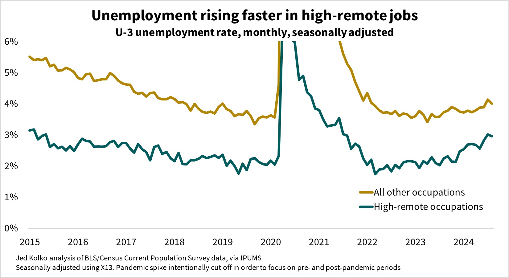
The recent rise in unemployment is steeper in occupations where remote work is more widespread. A continued rise could shift bargaining power towards employers who want workers to return to the office.
Last week Amazon announced that its workers would need to work in person five days a week starting in January. Since tech has been the sector most open to remote work, and Amazon is such a dominant tech company, Amazon’s announcement prompts the question: could remote work, after jumping during the pandemic and holding steadily high since, go into reverse?
Predictions about remote work tend to be grounded in structural arguments about its impact on productivity, flexibility, supervision, mentoring, and organizational culture. But the cyclical ups and downs of the labor market could matter, too. Working remotely is a perk, and workers have more bargaining power over perks (and everything else) when the labor market is tight. One academic study found that remote work was more widespread in states with tighter labor markets. In the emergence from the pandemic in 2022 and 2023, unemployment reached historic lows, giving workers bargaining power to resist calls to return to the office. Times might now be changing.
The Amazon announcement follows a period of rising unemployment, from a very low level of 3.4% in April 2023 to a still-low-by-historical-standards level of 4.2% in August 2024. However, the recent increase in unemployment has been sharper for people in occupations where remote work is more common.
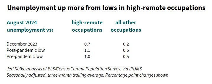
In August 2024, unemployment was 0.7 percentage points higher than in December 2023 in high-remote occupations, where people telework or work from home at least 25% of the time. In all other occupations, unemployment rose just 0.2 points from December 2023 to August 2024. Unemployment in high-remote occupations in August 2024 was 1.1 points above its post-pandemic low and 1 point above its pre-pandemic low, and is at its highest level since mid-2015 (excluding of course the pandemic spike in 2020 and 2021). In contrast, unemployment in all other occupations is just half a point above its post- and pre-pandemic lows, and is back up only to its 2018 level.
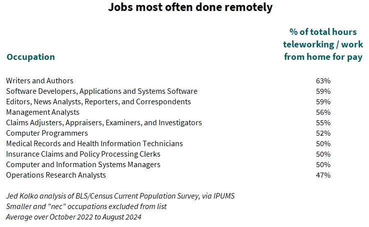
The rise in unemployment for high-remote occupations is more relevant for bargaining over remote work than the overall unemployment rate is. Remote work is concentrated in specific sectors. Just a quarter of jobs are in occupations where people work remotely at least 25% of the time. These occupations tend to be in tech, media, and business & financial operations. In a few occupations, people work remotely at least half the time. Of course, for many occupations telework is rare or nonexistent, like food prep, building maintenance, construction, mining, and transportation – changes in the unemployment rate in these sectors probably won’t have any effect on the prevalence of remote work.
Does the rising unemployment rate in high-remote occupations mean that Amazon’s new return-to-office policy is a bellwether? Hard to say. There’s no way to guess how much unemployment in high-remote occupations would have to rise to cause a significant decline in remote work. The post-pandemic period is too short to extrapolate from, and too much has changed from the pre-pandemic period to draw inferences about remote work from patterns in those days. Further, the relationship between remote work and the labor market is complicated: remote work has raised employment among people with disabilities and with caregiving responsibilities, for example – making it hard to tease apart and quantify the link between employment rates and remote work. All that said, the unemployment rate in high-remote occupations will be a number to watch.
Note: all data are from BLS/Census Current Population Survey monthly microdata, via IPUMS, seasonally adjusted by the author using X-13. Occupations are classified as high-remote based on the share of hours worked that were done via telework or working from home for pay over the period October 2022 to August 2024. New labor-force entrants who are unemployed (mostly age 21 and younger) lack an occupation and were excluded from this analysis; their exclusion means that the weighted average of the unemployment rates for high-remote occupations and all other occupations is a few tenths of a percentage point below the published unemployment rate.
In its latest projections, the Bureau of Labor Statistics projects the fastest growth in higher-wage occupations that require more education. Healthcare and tech jobs are projected to grow fastest, while sales and office jobs shrink most.
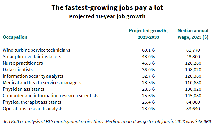
Renewable energy, healthcare, and tech are where the jobs are
Last week the Bureau of Labor Statistics (BLS) released its latest employment projections, for the period 2023-2033. These projections reveal how fundamental shifts could affect the labor market — they are intended to reflect structural changes in labor supply and demand, rather than short-term booms and busts. (See note.) Naturally these projections aren’t crystal balls: they can’t anticipate a recession, pandemic, natural disaster, or geopolitical crisis. But, still, these are well-reasoned, sober projections that suggest how the labor market could evolve.
The jobs projected to grow fastest over the next ten years include two in renewable energy — wind turbine service technicians and solar photovoltaic installers — and several in healthcare and technology. The top ten fastest growing jobs all pay more than the average job, and some pay well over twice the average.
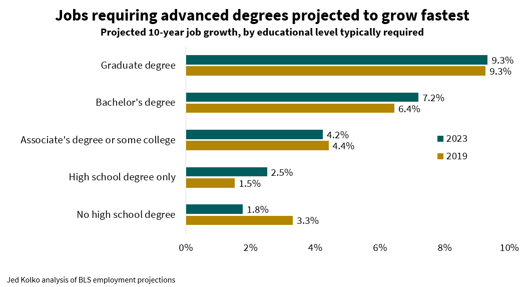
These high-paying, fast-growing jobs aren’t open to everyone, however. According to the BLS, seven of these ten jobs typically require at least bachelor’s degree, and three of those typically require a master’s degree.
Job growth favors high-pay, high-education jobs
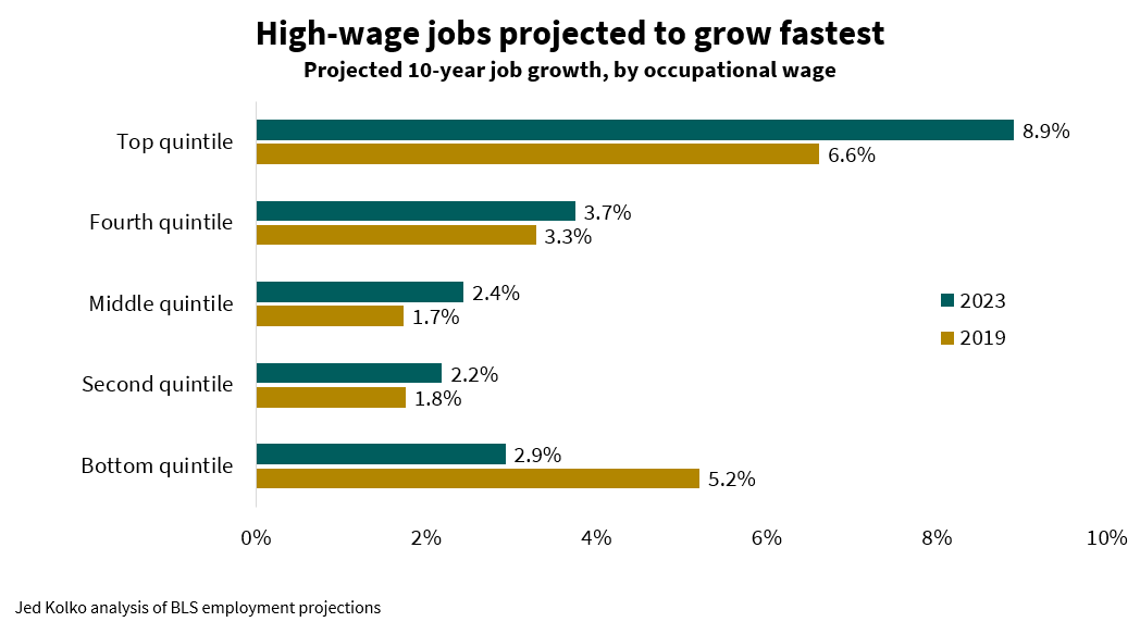
It’s not just a few tech and medical jobs: in general, high-pay, high-education jobs are projected to grow more than lower-pay jobs and those requiring less education. The highest-paying fifth of occupations (in other words, the top quintile) are projected to growth 8.9% between 2023 and 2033. Middle- and lower-paying occupations are projected to grow less than 3% over this period. In these latest projections, job growth is more skewed toward the highest-paying occupations than in the last pre-pandemic projection, for the period 2019-2029, which called for fast job growth in both the highest and lowest paying occupations.
Jobs requiring more education are projected to grow faster than those requiring less: 9.3% for those requiring a graduate degree versus just 2.5% for those requiring a high school degree only and 1.8% for those that don’t require a high school degree. Job growth is more skewed toward jobs requiring more education in the 2023 projection than it was in the pre-pandemic 2019 projection — mirroring the increasing skew toward higher-paying jobs.
Sector job projections today look similar to pre-pandemic forecasts
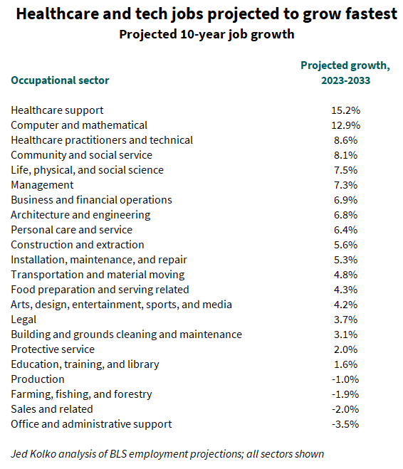
Among all occupational sectors, health care and computer and mathematical occupations are projected to grow most. But of 22 sectors, four are projected to show declines in employment. Two of these are goods sectors: production (that is, manufacturing) occupations, and farming/fishing/forestry jobs. However, the two sectors projected to decline most are in services: sales and related occupations, and office and administrative support occupations (like customer service representatives and bookkeeping and accounting clerks).
Despite all the upheaval and dislocation of the pandemic, these latest projections are broadly similar to the last pre-pandemic projections in 2019. The four sectors projected in 2023 to grow fastest were the same top four in 2019; the four sectors projected in 2023 to shrink were the same and only four sectors projected in 2019 to shrink.
One of the shifts between the 2019 and 2023 projections is slower growth for food preparation and serving related occupations. These jobs were projected to grow 7.3% over 2019-2029, and only 4.3% in the ten years over 2023-2033. Still, this slower projected growth for 2023-2033 is a sunnier picture for the sector than the alternative pandemic-impacted projection BLS published in 2019. This alternative projection called for a job losses in the food prep sector of 1.6% over 2019-2029 instead of the baseline 2019-2029 projection of a 7.3% gain. This alternative projection assumed long-lasting increases in remote work, declines in in-person food and entertainment, and increases in public health research and spending. Just as the macroeconomy rebounded strongly after the pandemic, with employment and GDP now above the pre-pandemic baseline, jobs that looked most at risk during the pandemic are poised to grow.
What about sales and office jobs? These are projected to shrink over the next ten years, but not because of the pandemic. Both of these sectors were projected to contract in the 2019 baseline projection, too. The ten-year growth projection for sales jobs was -2.0% in 2019 and -2.0% in 2023; for office and admin support jobs, the projection was -4.7% in 2019 and -3.5% in 2023. BLS projections earlier in the 2010s called for growth in these sectors, but by the eve of the pandemic they were already projected to shrink.
Finally, the 1.0% contraction in production jobs in the 2023 projection is an improvement on the 2019 baseline projection of a 4.5% decline. Furthermore, the manufacturing industry — which includes not just production jobs but jobs in a wide range of other occupations too — is projected to grow 0.8% over 2023-2033, after having been projected to shrink 3.5% in the pre-pandemic projection for 2019-2029. Growth of 0.8% in manufacturing is still below the overall economywide projected growth of 4.0% for 2023-2033, which means that manufacturing’s share of national employment would continue to fall over the next decade — but more gradually than in pre-pandemic projections.
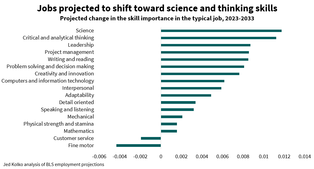
Skills demand will shift more toward science, away from fine motor skills
The 2023 projections are the first in which BLS included assessments of how important different skills are in each occupation. For instance, interpersonal skills are very important for counselors, psychologists, and therapists, but not so much for sewing machine operators, refuse collectors, and economists (!). Detail orientation skills are very important for anesthesiologists, nuclear technicians, and air traffic controllers, and less so for models, door-to-door salespeople, street vendors.
Because some occupations are projected to grow faster than others, and different skills are important in each occupation, the occupational projections imply that some skills will grow more in importance than others. Comparing the skill importance ratings of the typical job in 2023 with those of the projected typical job in 2033, science and critical and analytical thinking skills increase most in importance. Customer service and fine motor skills decline in importance, consistent with the projected contraction of production jobs (many of which rely on fine motor skills) and sales and office jobs (many of which require strong customer service skills).
Note: BLS projects employment in industries and occupations based on “long-term structural changes in the economy that are expected to affect the demand for an occupation in each industry.” These include changes to consumer demand, input sourcing, productivity, occupational substitution, and capital/labor substitution. More detail on the structural changes affecting individual occupations is available here.
The skills analysis is the change in the weighted average of skill importance across the detailed occupational distribution in 2023 and 2033.
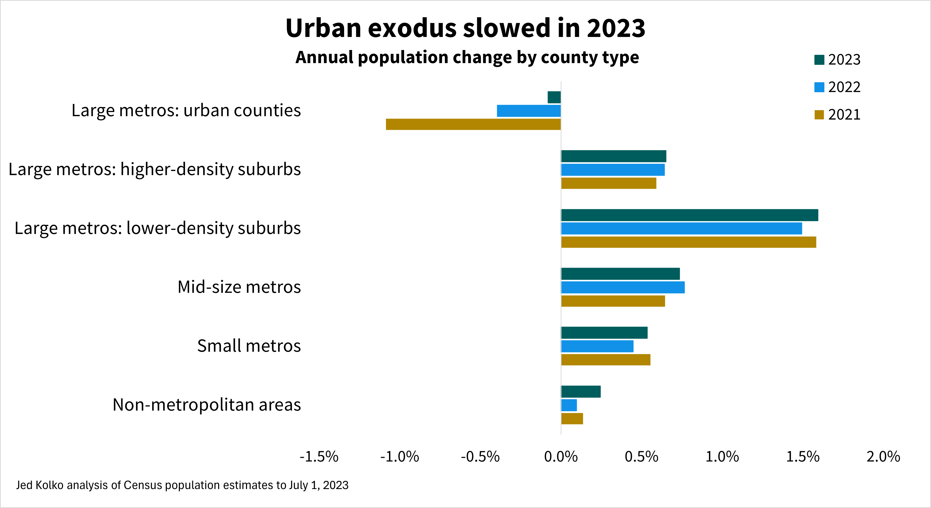
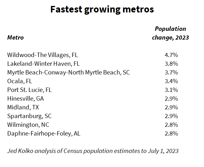
The nation’s most urban counties lost population in 2023 for the fourth year in a row, while lower-density suburbs grew at their fastest pace since the foreclosure crisis, according to the latest Census Bureau population estimates. The three largest metropolitan areas – New York, Los Angeles, and Chicago – all lost population in 2023. The fastest-growing metropolitan areas in 2023 were all smaller metros in the South.
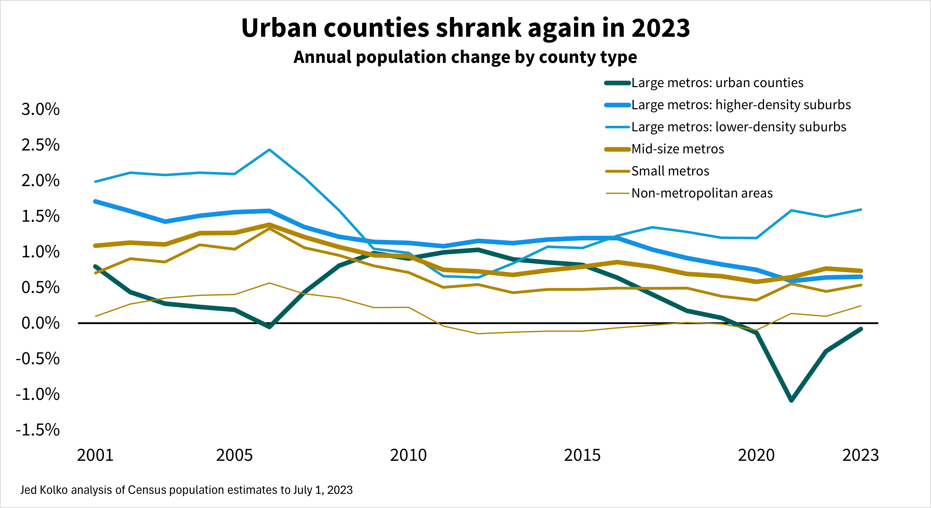
Once again, the urban counties of large metros lost population. These losses were milder in 2023 than in 2022 and 2021, during the pandemic out-migration from urban counties. But after those large pandemic losses, it’s surprising that urban counties continue to lose population.
Lower-density suburbs of large metros grew faster than other parts of large metros, mid-size and small metros, and non-metropolitan areas.
These lower-density suburban counties tend to be more affordable than urban counties and higher-density suburbs but still within commuting distance to the jobs, retail, and entertainment that large metros offer. Working from home some days a week makes longer commutes more manageable because they are less frequent.
Taking the longer view: population growth in urban counties was slowing even before the pandemic. Urban growth slowed during the early-to-mid 2000s housing bubble, as people moved to new construction in lower-density suburbs. Urban growth recovered during and after the foreclosure crisis, peaking in 2011 and 2012 before declining throughout the 2010s and turning negative in 2020. During most of the 21st century, urban counties of large metros have grown more slowly than their suburbs – often significantly so.
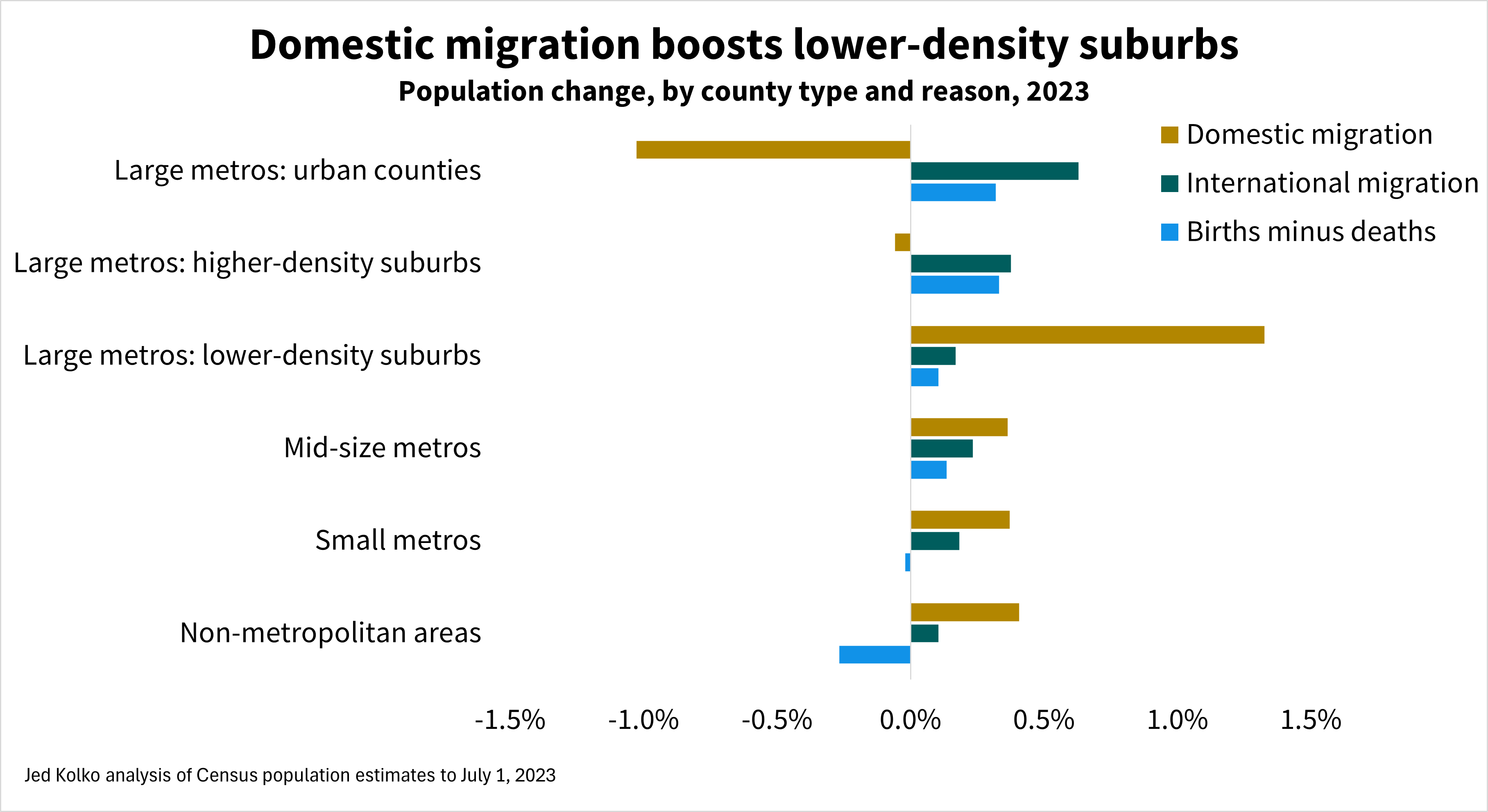
Population change has three components: domestic migration, international migration, and natural increase (births minus deaths). In 2023, as in most years, the rate of international migration was highest in urban counties and higher-density suburbs, while domestic migration favors lower-density suburbs, mid-size and small metros, and non-metropolitan areas. Smaller metros and non-metro counties were the only types of places where deaths exceeded births; these areas have older populations on average than larger metros do.
Urban populations are shrinking despite rising immigration. Nationally, immigration has rebounded. Net international migration added more growth to urban counties in 2023 than in any year since at least 2010 (see methodology note; 2010-2020 data might be revised in the future). However, urban counties lost more people due to domestic migration in 2023 than in the years before the pandemic. Domestic out-migration accelerated throughout the 2010s, spiked during pandemic, and continues to more than offset the urban population boost from immigration.
Growth has shifted toward the South
While the Sunbelt has grown faster than the Northeast and Midwest for decades, Sunbelt growth has become more concentrated in the South in recent years. In 2023, all ten of the fastest growing metros were in the South, and all were mid-size or small metros with none over one million population. (Note that the Census Bureau considers Texas part of the South region.)
This is a shift from 2019, the last year before the pandemic: then, the ten fastest-growing metros included five in the South and five in the West, including Greeley CO, Bend OR, and Boise ID. Also in 2019, one large metro, Austin, was among the top ten.
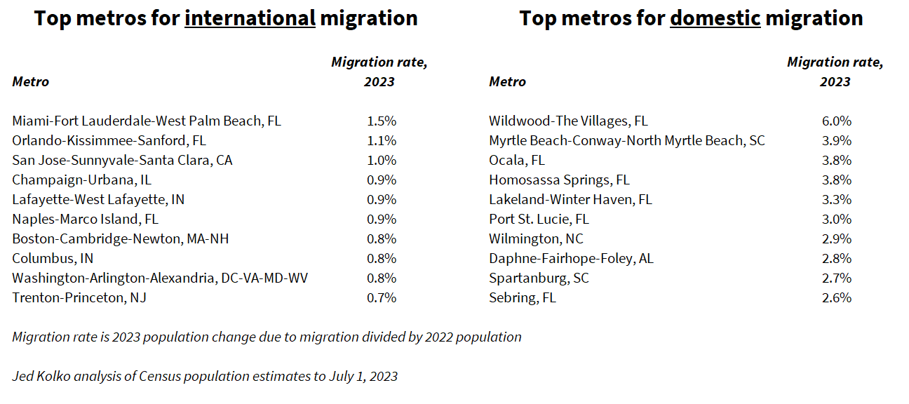
Population change is driven primarily by domestic migration, and the metros with the fastest population growth include many of the metros that grew most via domestic migration – a list also dominated by mid-size and small metros in the South. In contrast, the metros that grew most via international migration are quite a different group, including several large metros like Miami, Boston, and Washington DC as well as smaller metros with universities, like Champaign-Urbana IL and Lafayette-West Lafayette IN.
Although immigration slowed significantly before and during the pandemic and then rebounded, the geographic pattern of immigration has been relatively stable. The geographic pattern of domestic migration has changed more, shifting more in favor of the South and away from large metros.
(In other words: The correlations over time are lower for domestic migration than international migration. The population-weighted correlation between 2019 and 2023 international migration rates for metropolitan and micropolitan areas was .89; between 2016 and 2023, it was .94. The analogous correlations for domestic migration between 2019 and 2023 was .80; between 2016 and 2023 it was .74.)
Among the 387 U.S. metropolitan areas, 282 (73% of 387) gained population in 2023. But five of the largest fifteen lost population in 2023, including the three largest metros – New York, Los Angeles, and Chicago – as well as San Francisco and Detroit. Five additional metros of the largest fifteen would have lost population if it weren’t for immigration: Washington DC, Philadelphia, Miami, Boston, and Seattle. Only five of the largest fifteen metros had population gains that didn’t depend on immigration, all in the Sunbelt: Dallas, Houston, Atlanta, Phoenix, and Riverside CA. Immigration drives a disproportionate share of growth in the nation’s largest metros.
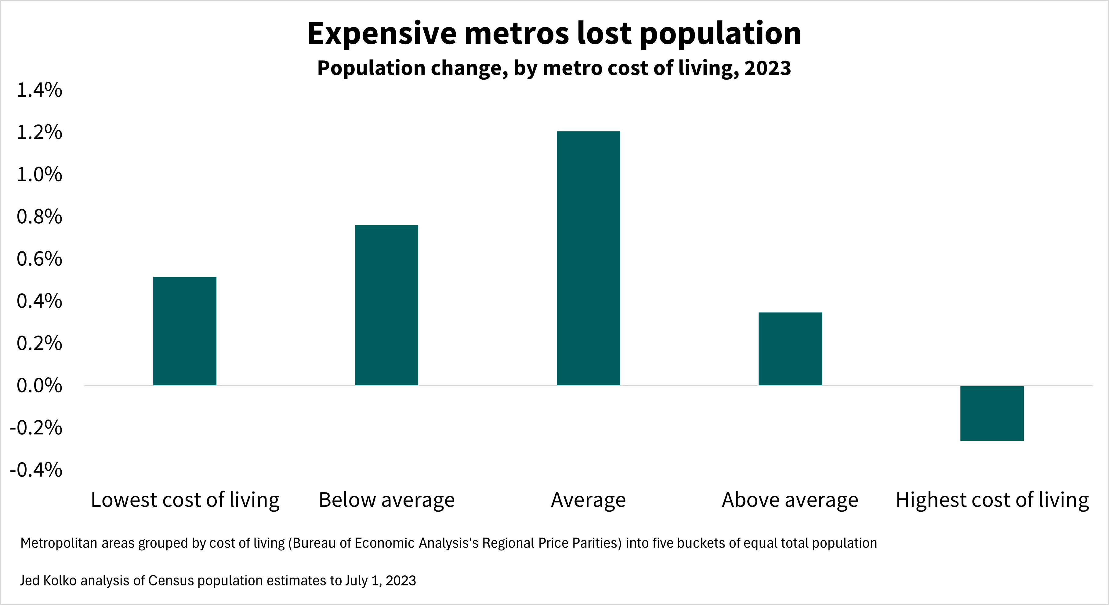
Finally, expensive metros lost people. Of the ten metros with the highest cost of living – many of which are in California – nine had population declines in 2023; Seattle was the one expensive metro that grew. But affordability is not, by itself, an economic development strategy. A low cost of living often reflects limited opportunities or longer-term economic decline, and in fact the most affordable metros grew more slowly than those where costs are closer to the national average.
Notes:
Population estimates are for the period starting July 1 of the previous year to July 1 of the labeled year. The 2023 estimates include revisions back to 2020 and incorporate 2020 decennial Census results. The 2010-2020 estimates have not yet been revised to reflect 2020 decennial Census counts; future revisions could change some of these findings. The 2000-2010 estimates were last revised to reflect 2010 decennial Census counts in 2016.
Census immigration estimates for 2023 are notably lower than recent estimates and projections from the Congressional Budget Office, which incorporate data from border encounters. The differing methodologies are compared here (see Appendix A) and implications for the labor market and economy are outlined here. CBO does not publish sub-national immigration estimates that can be compared with Census county population estimates.
The Census Bureau classifies migration between Puerto Rico and the fifty states plus D.C. as international migration.
Cost of living is based on the Bureau of Economic Analysis’s Regional Price Parities for 2022.
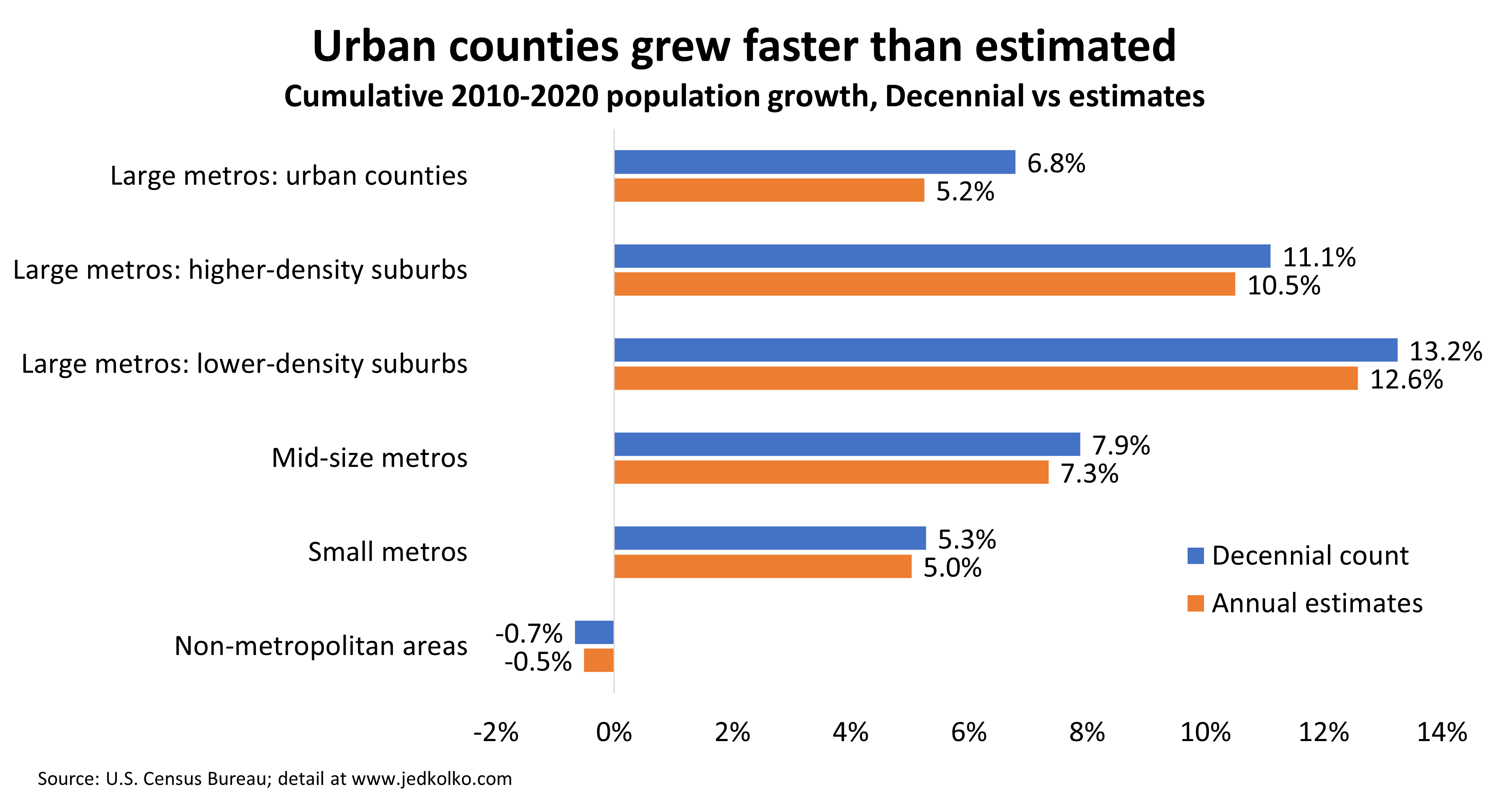
Urban counties grew faster than estimated. The big population swings of the 2010s were slightly smaller than estimated.
Yesterday the Census Bureau released its detailed population counts from the 2020 Census for redistricting purposes. It’s the first time that official 2020 population counts were published for counties and metro areas. For the most part they show that the US population moved toward the Sunbelt and the suburbs in the 2010s, confirming broad trends already published in the Census annual estimates. But the full count shows that the geography of the population shifted a bit less than estimated.
Overall the full Decennial count confirms what the annual estimates showed. The county-level correlation in ten-year population growth between the annual estimates and the Decennial count was 0.96 (weighted by 2010 count).
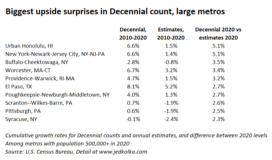
The biggest upside surprises — where the Decennial count for 2020 most exceeded the annual estimates for 2020 — were in urban counties and metro areas that had been estimated to grow more slowly. Over the decade, the population of urban counties grew 6.8%, ahead of the 5.2% from the annual estimates. And non-metropolitan counties shrank slightly more than estimated. Yet the broad story remains that suburbs outgrew urban counties, and that large metros outpaced smaller metros and non-metro counties.
Among large metros, there were both upside and downside surprises. The Decennial-count 2020 populations of metro Honolulu and New York were 5% higher than estimated. The biggest upside surprises include many metros that were estimated to have lost population in the 2010s but actually didn’t: Buffalo, Scranton, and Pittsburgh turned out to be larger at the end of the decade than at the start. Same with metro Chicago and Cleveland.
Across urban counties, the largest upside surprises were in the New York metro area. In Queens, Brooklyn, Essex NJ (Newark), and Hudson NJ (Jersey City), the Decennial count for 2020 was more than 7% higher than the annual estimate for 2020.
The downside surprises were Sunbelt metros that didn’t grow quite as fast as estimated. Phoenix and Cape Coral were more than 3% smaller in 2020 according to the Decennial count than in the annual estimates.
Across all counties, the weighted correlation between 2010-2020 estimated growth and the gap between the 2020 Decennial count and the 2020 estimate was -0.27. Counties estimated to have grown faster in the 2010s turned out have grown a bit less than estimated, on average, while counties estimated to have grown slower in the 2010s surprised a bit more on the upside in the Decennial count.
The 2020 Decennial count data are in the redistricting files. The annual estimates are here. In this analysis I used the April 1 estimates base data for both 2010 and 2020, to align with Decennial dates.
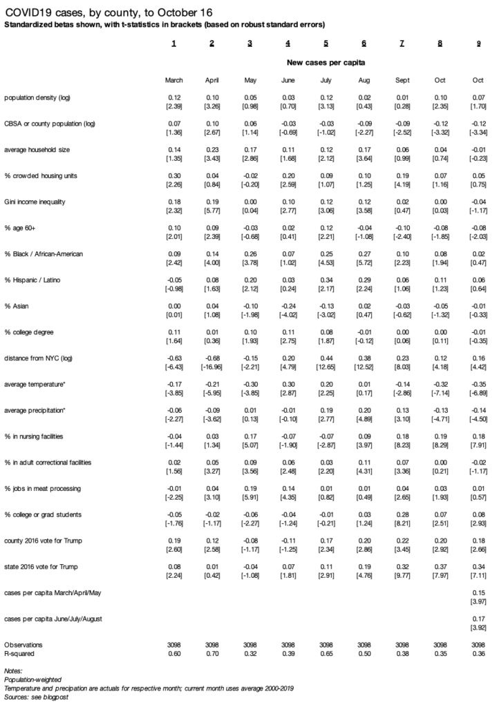
The surge of new cases in October is concentrated in colder, less populated, more Republican-leaning counties. Places that suffered springtime or summer surges have more cases in October, adjusted for other factors.
As new COVID19 cases start a third climb in America, the geographic pattern is shifting. The first wave, in the spring, was centered around New York. The second wave, in the summer, hit Sunbelt states like Florida and Arizona. Now, northern states like Montana, the Dakotas, and Wisconsin have the highest new-case rates per capita.
October case rates are higher in colder, less populated, Republican-leaning counties. Unlike earlier in the pandemic, household size, residential crowding, and local racial/ethnic composition now have no relationship with county case rates. And, strikingly, places with higher case rates in springtime or summer have higher case rates now, rather than having developed relative local immunity or resistance.
The analysis follows previous versions, here and here: I regress new cases per capita (i.e. case rates) on a set of demographic, geographic, weather, and partisanship variables. I include several measures for local presence of institutions where cases have been clustered: nursing homes, meat-packing plants, correctional facilities, and colleges. County-level case data come from the New York Times, and other data sources and methodological notes are described here. Each month is a separate population-weighted regression. Standardized betas (to standard deviation = 1) and robust standard errors are shown in the table at the end of this post.
Five points stand out about the October surge.
First: new cases are higher in colder places. Average daily temperature has a large, negative, and statistically significant relationship with new cases per capita in October. The relationship between temperature and local case rates fits the pattern of indoor/outdoor activity. Temperature was positively related to case rates in June and July — when the outdoors are more comfortable in cooler parts of the country — and negatively related in March, April, and May and now again in September and even more so in October — when the outdoors are more comfortable in warmer parts of the country. Note that temperature and precipitation are actual values by county for March to September and the 2000-2019 average for October.
Second is partisanship. Case rates are higher in states that voted more strongly for Trump in 2016 — and in redder counties. The relationship between county and especially state partisanship and case rates has grown in recent months. In October state partisanship and county temperature are the strongest predictors of new case rates.
Third is that smaller places have higher case rates in October, as they have for several months. The coefficient on population — for metropolitan area, micropolitan area, or non-metro/micro county — has been negative and significant since August. County population density has a positive effect in October (column 8) though weaker when previous waves are included as controls (column 9).
Fourth: case rates remain higher in college towns in October, though much less so than in September. In October, the presence of local nursing facilities has a stronger association with new case rates than local correctional facilities, meat-packing plants, or colleges and universities do.
Fifth: October case rates are higher in counties that had worse outbreaks in either the springtime or summer peaks, controlling for all the other local factors. This might be surprising since the worst outbreaks in October are in the north-central part of the country, a different region from the where the springtime (New York) and summer waves (Sunbelt) were concentrated. Without controlling for other factors, county-level October case rates are negatively correlated with springtime case rates and positively correlated with summer case rates.
This suggests that the changing geographic pattern of COVID19 cases is due to broad shifts in the importance of factors like temperature, partisanship, and urbanness rather than the development of local resistance.
New cases of COVID19 are now as prevalent in red counties as in blue counties, for the first time in this pandemic. The geography of new COVID19 cases is shifting toward places that are warmer, younger, have more crowded housing units, and are farther away from New York.
The COVID19 pandemic has been much more severe in denser counties and larger metros in America — which tend to vote Democratic. Metro New York has had the most deaths per capita cumulatively, and by far the highest raw count. Seven of the ten metros with the highest death rates are in the Northeast.
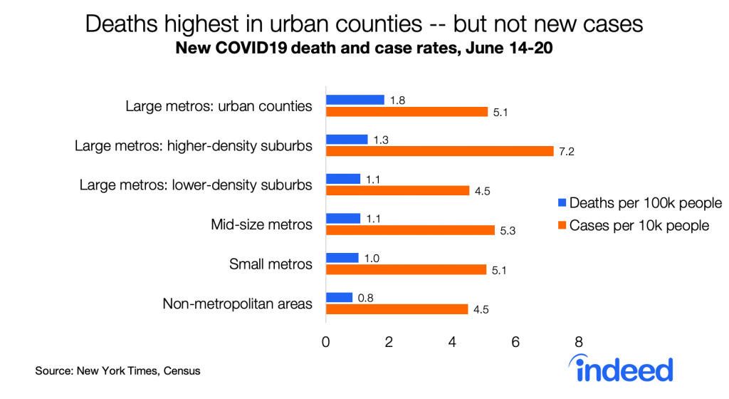
But now the geography of COVID19 is changing. Whereas death rates had been far higher in urban counties than in the rest of the country — eight times higher than in non-metropolitan areas as of mid-May — those gaps have narrowed. Death rates in the last week are only twice as high in urban counties as in non-metropolitan areas, and new case rates are no longer highest in urban counties.
Strikingly, new case rates are now as high in red counties as in blue counties, for the first time in this pandemic. This is consistent with case rates now being similar in larger metros (which lean blue) and in smaller and non-metro areas (which lean red). New cases per capita started to rise around Memorial Day in red counties though not in blue counties.
Death rates remain much higher in blue counties — 79% higher than in red counties. Still, the partisan gap in death rates is narrowing.
Partisan differences in death and case rates presumably contribute to differences in public opinion between Democrats and Republicans about the coronavirus pandemic. But that doesn’t mean politics — or partisan policy — caused higher case and death rates in blue places. In the US partisanship is correlated with most local differences. Compared with Republican-leaning counties, Democratic-leaning counties have higher population density, larger and more crowded households, higher income inequality, and a younger and more racially diverse population. They also have lower shares of people in nursing homes, in correctional facilities, and working in meat-processing industries — all sites of numerous COVID19 outbreaks.
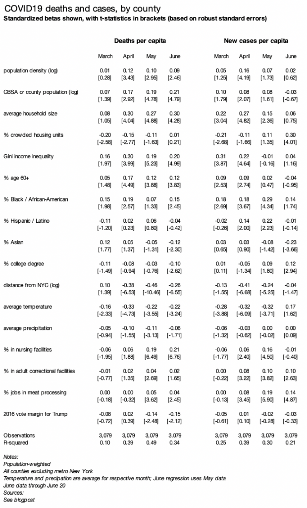
A simple regression shows which factors are associated with changes in local prevalence of COVID19. As in my earlier blogpost, I regress deaths (or cases) per capita, by county, weighted by county population, on several county variables. The table reports standardized betas, with all variables transformed to have a variance of one, along with t-statistics based on robust standard errors.
The regression table below includes three changes from the earlier blogpost. First, I add three new variables: % in nursing homes (2010 Census), % in adult correctional facilities (2010 Census), and % working in meat-processing businesses (2017 County Business Patterns). Second, I run the model separately for each of four time periods: March, April, May, and June through the 20th. Third, I look at add regressions for case rates.
Several factors have a different association with June case rates than they did with June death rates and with earlier case rates:
Higher shares of older (60+) and nursing-home residents were NOT associated with higher June case rates, but were associated with higher June death rates and with earlier death and case rates. It may be that measures to protect older adults from infection have been successful, even though they still have a higher fatality rate once infected.
Colder temperatures were not associated with higher June case rates, but were associated with higher June death rates and with earlier death and case rates. This might reflect the relatively higher risk of indoor transmission — as summer begins, people in colder places shift more to outdoor activities while people in warmer parts of the country might spend more time indoors in air-conditioning.
Crowded housing units were positively associated with June case rates, but not June death rates or earlier case or death rates.
A few other notable general patterns:
Counties with a higher share of Blacks or African-Americans continue to have higher rates of deaths and new cases, despite other shifts in the geography of COVID19. The relationship wavers in strength and isn’t statistically significant in every month, but it’s among the most consistent patterns over time.
In contrast, counties with a higher share of Asian-Americans have lower death and case rates now, even though they had higher death rates in March, early in the pandemic.
Counties with more people in correctional facilities or working in meat-processing have higher case rates. Death rates, however, are notably higher in places with more people in nursing homes.
The pandemic is now less centered around New York. In April and May, proximity to New York was the strongest factor associated with higher death rates. In June, the relationship between distance from New York and both death and case rates weakened.
Finally, controlling for all these other factors, partisanship has no relationship with case rates. Furthermore, death rates had a stronger relationship with Democratic vote share in 2016 in May and June than in March or April — even though the unadjusted partisan gap (i.e. the trend without any controls) has narrowed. Thus, other factors discussed above — not politics per se — have driven the shrinking of the partisan gap in death rates and the closing of the gap in case rates.
(text continues below, after the long table)
The geography of COVID19 changed more in June for cases than for deaths. It’s unlikely that’s because of more widespread testing in red-leaning places since the positive test rate has recently increased in states where cases are rising, like Arizona, Florida, and Texas, but falling in earlier hard-hit states like New York.
There are several possible reasons why the pattern of cases is changing more than the pattern of deaths. Deaths lag new infections, so perhaps these changing geographic patterns just haven’t shown up for deaths yet. Or, it may be that the COVID19 fatality rate once infected is falling nationally as medical responses improve, so that places with new cases might not have as many deaths as places that had more cases earlier. Or, it may be that the fatality rate once infected is lower in the types of places now experiencing outbreaks than in places that suffered more earlier in the pandemic.
At this point it’s unclear why geographic pattern of death rates has changed less than the pattern of case rates — or whether the pattern of death rates will soon shift to look more like the new pattern of case rates. That should become clearer in the coming weeks.
This is an update to an earlier blogpost about local COVID19 death rates, which includes detailed methodological and source notes. I will do my best to answer questions emailed through www.jedkolko.com/contact or at @jedkolko.
Local differences in COVID19 deaths follow persistent patterns. The strongest predictor of high local death rate is now proximity to New York.
Using the New York Times’s published daily counts of COVID19 cases and deaths by county, I’ve been tracking local differences and analyzing the factors correlated with higher death rates. This blogpost was first published on April 15, 2020, and was updated May 13. The county-level data are available for download at the end of the post, along with data definitions and sources. I will do my best to answer questions emailed through www.jedkolko.com/contact or at @jedkolko.
Metro New York has the nation’s highest death rate. Many of the other metros with the highest death rates are near New York. Seven of the top ten are in the Northeast, and none is west of New Orleans. The death count is almost nine times higher in New York than in Detroit, the metro with the second-highest count nationally.
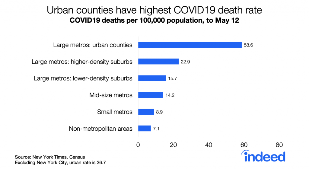
Urban counties have the highest death rates, followed by suburbs, smaller metros, and rural areas. The urban death rate remains significantly higher than in other places even excluding New York City.
Descriptively, higher density counties have higher death rates. The correlation between density and death rates is 0.45. Excluding metro New York, the correlation is 0.26 — lower but still statistically significant. Notably, the correlation between density and per capita death rates has strengthened slightly over the past four weeks as death rates nationally have nearly tripled. While fewer suburban and rural counties are untouched by COVID19 than four weeks ago, death rates remain higher in denser counties and larger metros.
Density is correlated with many factors that have been hypothesized to be a mechanism for COVID19 outbreaks and transmission. A simple regression model helps assess which factors correlated with density are more strongly correlated with local death rates.
I use a model of deaths per capita, by county, weighted by county population, with county variables explained at the end of this post. The table reports standardized betas, with all variables transformed to have a variance of one, along with t-statistics. Metropolitan New York is excluded from these regressions since New York has a very high death rate, is very large and therefore contributes more to the population-weighted regressions, and has extreme values for many variables like density. Using deaths per capita rather than deaths can create problems, but the alternative of regressing counts on counts means that size swamps all other factors and results in meaninglessly high goodness-of-fit.
Column 1 in the regression table below is the baseline model, repeated from the original blogpost but with data through May 12. Death rates are higher in counties with a higher share of older and African-American residents, and in places where March 2020 was colder. Death rates are higher in denser counties and in more populous metros, even when controlling for demographics and weather.
Column 2 adds four variables all positively correlated with density: transit usage, the Gini coefficient measuring household income inequality, average household size, and share of crowded households with more than one person per room. All are positive and meaningfully large except the crowded variable, though even with these included the density and metro size variables remain statistically significant.
Column 3 adds the log of distance from the county to New York City. Its effect is negative, statistically significant, and larger than all other variables when comparing coefficients on a standardized scale. Put simply: the closer a county is to New York City, the higher the death rate, even after controlling for density, metro size, demographics, weather, and other factors.
Column 4 presents the same model as column 3, but for deaths rates four weeks earlier, on April 14 instead of May 12. Strikingly, few variables look different. Even though the national death count was almost three times higher on May 12 than on April 14, the patterns are largely similar. Death rates now, like then, are higher in denser counties in larger metros, with older and more African-American populations, and colder weather.
Two shifts over the past four weeks stand out. First is that death rates have become increasingly correlated with proximity to New York — the standardized coefficient grew in magnitude from -0.15 to -0.42. Second is that these factors explain more of the variation in death rates across counties, with the r-squared rising from 0.23 to 0.44. In that sense, patterns in local death rates are becoming less random as the pandemic proceeds, even though each week brings new outbreaks and hotspots.
Overall the patterns of local death rates has been more continuity than change. Comparing deaths per capita four weeks ago, on April 14, with subsequent deaths per capita in the past four weeks, between April 14 and May 12, the correlation across counties is 0.82, population weighted. That means that the places with higher death rates a month ago have had higher death rates since then.
One other pattern persists. Both death rates and case rates remain higher in Democratic-leaning counties than in Republican-leaning counties, based on the 2016 presidential vote. The gap has narrowed modestly: the death rate was 4.0 times higher in blue counties than red counties on April 7, and 3.3 times higher on May 12. The ratio of case rates in blue counties versus red counties has fallen from 2.8 to 2.4. This persistent partisan gap in death rates probably contributes to the stubbornly partisan politics of physical distancing and stay-at-home orders.
A few closing thoughts. Most of this analysis excludes New York, which is such an extreme case in many ways. The reasons that explain New York’s high death rates appear to be somewhat different from the factors that explain variation in death rates across the country. In fact, research on New York City neighborhoods suggests death rates within the city are higher in lower-density neighborhoods with more residential crowding — the opposite of what we find when comparing countries across the US. Furthermore, outside the US there are many examples of extraordinarily dense cities with low death rates, like Hong Kong. The factors that explain variation in death rates internationally, or among neighborhoods within a city, can differ from those that explain variation across counties or metros within the US.
Here is the dataset (click here) I’ve been using. I’ve included all the variables that are publicly shareable, with case and death counts as of May 12 as published by the New York Times. A few counties around New York City (my own pseudo-FIPS 36991), Kansas City MO (pseudo-FIPS 29991), and Joplin MO (pseudo-FIPS 29992) have been combined in accordance with the NYT readme file. Other variables include:
Hospitality jobs and oil jobs are from County Business Patterns 2017. Hospitality includes NAICS 481, 71, and 72. Oil includes NAICS 211, 213111, and 213112. I imputed values for suppressed cells.
lndistance is the log of distance from the population-weighted county centroid to the population-weighted county centroid of Manhattan
college is % with bachelor degree or more, table S1501.
seasonal_units, tables B25002 and B25004.
wfh_share is the % of county residents working in occupations that can be done from home, based on occupational coding by Dingel and Neiman and table S2401.
transit_modeshare and wfh_modeshare are the % of county residents who commute by transit or work from home, table B08006.
italy_born and china_born are the % of county residents born in Italy or China, tables B05002 and B05006.
gini is the gini coefficient for household income inequality, table B19083
hhsize is average household size, and crowded is % of households with more than one person per room, table DP04
county-pair matrix of connections based on mobile-device patterns from PlaceIQ, from a team of academic economists
And thanks to numerous folks for sharing data and ideas, including (but hardly limited to!) @_dmca, @GephenS, @LoriThombs, @TradeDiversion, @jessiehandbury, @bdkilleen, @gissong, and @jm0rt.
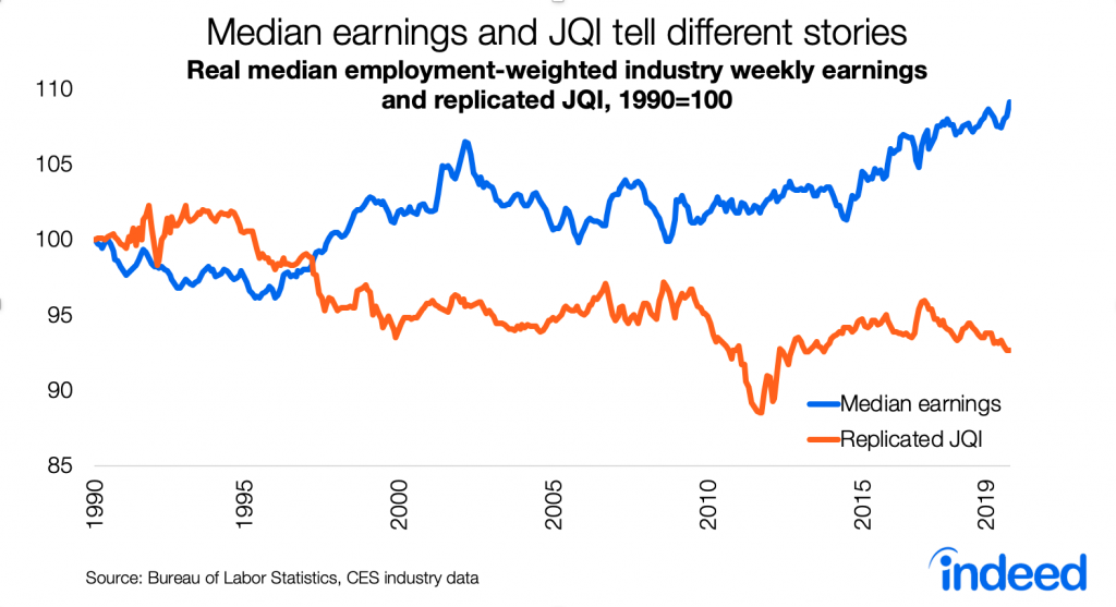
Although the new Jobs Quality Index is falling, more compelling measures of job quality have recently picked up.
A few weeks ago, a new index of the US labor market rang alarm bells. The Cornell-CPA US Private Sector Job Quality Index (JQI for short) showed job quality today to be lower than in the 1990s and 2000s. Despite some improvement from 2012 to 2017, the index drifted back down after 2017. Today the JQI is at its lowest point in almost six years.
The JQI tells a very different story about the labor market than the low unemployment rate, strong payroll growth, and a host of other improving labor-market indicators in recent years. Instead, the JQI’s drop in job quality appears to be consistent with longer-term negative trends — like the disappearance of manufacturing jobs, cutbacks in employee benefits, and loss of job security.
But a more straightforward and compelling measure of job quality — using the same earnings data as the JQI — shows that inflation-adjusted earnings have recently risen to their highest point in decades. Broader measures of job quality using very different data do point to longer-term worries for the labor market, but you need to go beyond earnings-based measures to see that.
Unpacking the JQI
Let’s start with how the JQI is constructed. The index uses average weekly earnings data by industry for production and non-supervisory workers in nearly all private-sector industries, from the monthly jobs report. It defines high-quality jobs as those in industries where average weekly earnings are above the economy-wide average, and defines the rest as low-quality jobs. Jobs in computer systems design, power generation and supply, and securities and commodity brokerage are high quality; jobs in restaurants, clothing stores, and personal care services are not. The index is the ratio of high-quality jobs to low-quality jobs. That rings true so far.
Here’s the wrinkle: in the JQI, each industry’s weekly earnings is compared against the economy-wide average for that month, to determine whether that industry’s jobs are high or low quality. In other words, the index grades the labor market on a curve that resets monthly. That means the index measures the skewness, or lopsidedness, of the wage distribution — a non-standard measure that can have counter-intuitive properties.
For instance, if inflation-adjusted weekly earnings doubled for all jobs, it’s hard to deny that workers would be better off — yet the JQI would remain unchanged. Or this example: if weekly earnings in the lowest-paying industries plummeted, making the worst-off workers even worse off, the JQI would improve. Why? Economy-wide average earnings would fall, vaulting some middle-paying industries above the average to become high-quality jobs. And on the flip side, the JQI could fall if earnings in the lowest-paid industries rose. Spoiler: that’s what’s happening now.
Earnings have recently improved, especially in low-paying industries
Let’s start with the same ingredients but with a simpler recipe. Below is a chart of median weekly earnings across industries over time, adjusted for inflation, for the same production & non-supervisory workers in the same industries, similarly weighted by industry employment, as the JQI uses. Inflation-adjusted median weekly earnings capture changes in hourly wages relative to living costs, as well changes to weekly hours worked. Unlike the JQI, the trend in median weekly earnings isn’t graded on an ever-shifting curve — so it shows more directly the trend in how much you’d earn from the typical job.
Real median weekly earnings fell during much of the 1990s, rose dramatically in the late 1990s and early 2000s, followed by a long period of stagnation from 2003 to 2015. (Remember that both median earnings and the JQI reflect the composition, not just the quantity, of jobs in the labor market.) Then, with the recent continued tightening of the labor market, median weekly earnings rose steadily starting in 2015 and is now at the highest point of the series. This index was 9% higher in 2019 than in 1990. Median job quality has improved, not fallen, both in recent years and longer term.
What about those struggling in the labor market? The longer-term trend in weekly earnings is less rosy at the bottom of the distribution but still clearly positive in recent years. Weekly earnings at the 25th percentile improved from a low in 2014, though only back to their 1990s level. They remain below where they were throughout the 2000s. The story is better at the 10th percentile, where weekly earnings are now just slightly below their highest point in the series, after falling in the 2000s and climbing back up since 2010.
Reconciling the JQI with the trends in weekly earnings
Why do straightforward trends in weekly earnings tell such a different story than the Job Quality Index? Remember that the JQI is an index of skewness. As noted above, the JQI could fall if weekly earnings in the lowest-earning industries grew strongly. Right now, that’s what’s happening. Weekly earnings have been rising overall and even more steeply in the lowest-earnings industries. Since the start of 2017, real weekly earnings are up 2% at the median and a whopping 7% at the 10th percentile — which is great news for job quality.
Furthermore, the JQI is out of step with other measures of job quality. The New Hires Quality Index from the Upjohn Institute tracks wages for new hires based on occupations — it has been rising since 2015 and is near its record high since the series began in 2001. And Gallup reports that the share of people who think now is a good time to find a quality job is also near a high point since they started asking in 2001.
The JQI does serve as a necessary reminder that the 50-year-record-low headline unemployment rate overstates the health of the labor market. Broader measures of employment aren’t back to their pre-2000 levels. Many workers are stuck with second-class contractor status, unpredictable schedules, and non-compete agreements. Jobs with benefits are rarer than they used to be, especially for workers without a college degree. Mobility and dynamism are in long-term decline. Automation threatens some jobs, and labor-market polarization may worsen. The richest cities are getting richer while other places suffer job losses. Relative to other OECD countries, the US is in the middle of the pack on some job quality measures and below the midpoint on others. But these very real concerns are outside the scope of what the JQI — or any index based on wages, earnings, or incomes — actually measures.
Notes:
The original analysis, replication, and simulations in this post use the same data source as the JQI: BLS series IDs CESxxxxxxxx06 for employment and CESxxxxxxxx30 for average weekly earnings, where xxxxxxxx is the industry code. These are seasonally adjusted series for production and non-supervisory workers. The 175 industries listed in the November 2019 JQI report are included. I replicated the preliminary JQI, which does not adjust for “flip” categories.
Skewness is not the same as variance, which is often used to measure inequality or polarization. Variance is the second moment of a distribution; skewness is the third moment.
This post expands on my Twitter thread from several weeks ago.
Yesterday I published a story at FiveThirtyEight showing that Las Vegas is the metro whose demographics today look most like America’s projected demographics in 2060.
In the above tweet, “most common” is the mode, not the median or mean. For bi- or multi-racial, “0” means younger than one year, NOT the absence of data.
These analyses use seven categories of race/ethnicity, which cover the entire population and are mutually exclusive. The Census asks separate questions about race and Hispanic origin; Hispanics can be of any race. The seven categories are among the full set here and include:
Not Hispanic, White alone
Not Hispanic, Black or African American alone
Not Hispanic, American Indian and Alaska Native alone
Not Hispanic, Asian alone
Not Hispanic, Native Hawaiian and Other Pacific Islander alone
Today in The Upshot, I explain that the suburbanization of America continues, not only for the country overall but in four-fifths of the largest metros. The few that buck the trend and are in fact becoming more urban are generally those that were denser to begin with. This supplemental post describes the data, methods, and results behind these findings.
Most large metros comprise a handful of counties; some metros, like San Diego, Las Vegas, and New Haven, consist of a single county. County trends alone, therefore, show little or nothing about population shifts within metros. To get a more granular view, I augmented the 2016 Census county population estimates with Census-tract-level counts of occupied housing units from the U.S. Postal Service, which are also available through 2016. (The most recent Census-tract data from the Census are from the 2015 five-year American Community Survey, which averages data over the years 2011-2015, in effect lagging the USPS counts by three years.)
I use Census tract density, rather than political city boundaries, as an indicator of urban and suburban. Cities, as defined by political boundaries, vary considerably in how urban they are. Furthermore, in many metros there are places within the main city’s border that are less dense – i.e. more suburban – than places outside the main city: Hoboken is more urban than Staten Island, and the western portions of the San Fernando Valley within the City of Los Angeles are more suburban than West Hollywood and Santa Monica. See this post for more on density as an indicator of urbanness and suburbanness.
For each year, I allocated each county’s Census population estimate to Census tracts in proportion to the tract’s share of USPS occupied addresses in the county. I then calculated the change in tract-weighted average density from 2010 to 2016, using the estimated population of each tract in 2010 and 2016 and tract household density from the 2010 Census. By definition, average neighborhood density increased in metros where higher-density (that is, more urban) tracts grew faster than lower-density (more suburban) tracts; average density decreased in metros where lower-density tracts grew faster than higher-density ones. Note that this “average neighborhood density” measure reflects only the change in density due specifically to the changing spatial distribution of the population within a metro, and is unaffected by population growth that is spatially uniform within a metro.
This method uses Census data to the degree possible and USPS counts where necessary, since the Census is more definitive while the USPS data are more recent and granular. An alternative is to rely solely on the USPS occupied-address counts for tracts. The results are essentially the same: the metro-level correlation between the change in density measured using the USPS-only alternative and the change in density using my preferred hybrid Census-USPS approach is 0.97.
I also looked at home-price changes within metros using two different ZIP-code-level data sources: FHFA and Zillow. My measure of whether home prices are rising faster in urban or suburban neighborhoods within a metro is the coefficient from a tract-level regression of the 2010-2016 change in home prices on the log of household density, weighted by the number of households in the tract.
Density for metros as a whole is tract-weighted households per square mile in 2010.
Data on the local prevalence of urban planners come from the Bureau of Labor Statistics’ Occupational Employment Statistics. I used the location quotient, which reflects the share of a metro’s workforce that is urban planners, relative to the share of the national workforce that is urban planners. The metros with the highest location quotients for urban planners are Sacramento (3.1, which means that the share of urban planners there is more than three times the national average), Seattle (2.6), and San Francisco (2.2). Note that the BLSs published tables report metropolitan divisions, whereas I calculated the data for metropolitan areas (CBSAs).
Results
All of the results are for the 51 metropolitan areas (Core Based Statistical Areas) with at least one million people in 2010, using the latest (2015) definitions.
The suburbanization of America is the result of two distinct shifts: between metros and within metros. First is that the densest metros – places like New York and San Francisco – are growing somewhat more slowly that less-tightly-packed metros like Austin, Raleigh, and Orlando. (The correlation among the 51 largest metros between (1) the log of tract-weighted metro density in 2010 and (2) population growth from 2010 to 2016 is -0.17, which is not statistically significant at the 5% level.) Second is that in 41 of the 51 largest metros, lower-density Census tracts grew faster than higher-density Census tracts from 2010 to 2016 – i.e. they become more suburban.
Among the 51 largest metros, the change in metro-level density from 2010 to 2016 – my key measure of trending urbanization or suburbanization – is correlated with several relevant variables. The correlation with the change in metro-level density is:
-0.49 for metro population change, 2010-2016. That is, faster-growing metros became more suburban.
35 for the log of tract-weighted metro density in 2010. That is, denser metros became more urban.
28 for the urban-planner location quotient. That is, metros with a higher share of urban planners became more urban. Notably, Austin is an exception, with a high share of urban planners (LQ=1.9) yet faster growth in lower-density neighborhoods.
All of the above correlations are statistically significant at the 5% level.
There were also patterns in which metros saw faster home-price growth in urban than in suburban neighborhoods. Within metros, home prices rose faster in higher-density neighborhoods than in lower-density neighborhoods in 44 of the 51 largest metros, according to the FHFA home price index (and in 37 of 51, according to the Zillow index). That is: in most metros prices rose faster in urban than suburban neighborhoods. The correlation with the extent to which home prices grew faster in the more urban neighborhoods of a metro is:
45 for metro population change, 2010-2016. That is, in faster-growing metros, home price increases were higher in urban relative to suburban neighborhoods.
32 for the log of tract-weighted metro density in 2010. That is, in denser metros, home price increases were higher in urban relative to suburban neighborhoods.
Both of the above correlations are for the FHFA home price index and are statistically significant at the 5% level. The correlations are very similar when calculated with the Zillow index instead of the FHFA home price index.