New cases of COVID19 are now as prevalent in red counties as in blue counties, for the first time in this pandemic. The geography of new COVID19 cases is shifting toward places that are warmer, younger, have more crowded housing units, and are farther away from New York.
The COVID19 pandemic has been much more severe in denser counties and larger metros in America — which tend to vote Democratic. Metro New York has had the most deaths per capita cumulatively, and by far the highest raw count. Seven of the ten metros with the highest death rates are in the Northeast.

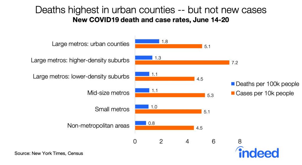
But now the geography of COVID19 is changing. Whereas death rates had been far higher in urban counties than in the rest of the country — eight times higher than in non-metropolitan areas as of mid-May — those gaps have narrowed. Death rates in the last week are only twice as high in urban counties as in non-metropolitan areas, and new case rates are no longer highest in urban counties.
Strikingly, new case rates are now as high in red counties as in blue counties, for the first time in this pandemic. This is consistent with case rates now being similar in larger metros (which lean blue) and in smaller and non-metro areas (which lean red). New cases per capita started to rise around Memorial Day in red counties though not in blue counties.

Death rates remain much higher in blue counties — 79% higher than in red counties. Still, the partisan gap in death rates is narrowing.

Partisan differences in death and case rates presumably contribute to differences in public opinion between Democrats and Republicans about the coronavirus pandemic. But that doesn’t mean politics — or partisan policy — caused higher case and death rates in blue places. In the US partisanship is correlated with most local differences. Compared with Republican-leaning counties, Democratic-leaning counties have higher population density, larger and more crowded households, higher income inequality, and a younger and more racially diverse population. They also have lower shares of people in nursing homes, in correctional facilities, and working in meat-processing industries — all sites of numerous COVID19 outbreaks.
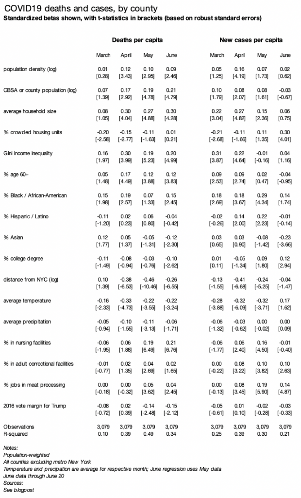
A simple regression shows which factors are associated with changes in local prevalence of COVID19. As in my earlier blogpost, I regress deaths (or cases) per capita, by county, weighted by county population, on several county variables. The table reports standardized betas, with all variables transformed to have a variance of one, along with t-statistics based on robust standard errors.
The regression table below includes three changes from the earlier blogpost. First, I add three new variables: % in nursing homes (2010 Census), % in adult correctional facilities (2010 Census), and % working in meat-processing businesses (2017 County Business Patterns). Second, I run the model separately for each of four time periods: March, April, May, and June through the 20th. Third, I look at add regressions for case rates.
Several factors have a different association with June case rates than they did with June death rates and with earlier case rates:
- Higher shares of older (60+) and nursing-home residents were NOT associated with higher June case rates, but were associated with higher June death rates and with earlier death and case rates. It may be that measures to protect older adults from infection have been successful, even though they still have a higher fatality rate once infected.
- Colder temperatures were not associated with higher June case rates, but were associated with higher June death rates and with earlier death and case rates. This might reflect the relatively higher risk of indoor transmission — as summer begins, people in colder places shift more to outdoor activities while people in warmer parts of the country might spend more time indoors in air-conditioning.
- Crowded housing units were positively associated with June case rates, but not June death rates or earlier case or death rates.
A few other notable general patterns:
- Counties with a higher share of Blacks or African-Americans continue to have higher rates of deaths and new cases, despite other shifts in the geography of COVID19. The relationship wavers in strength and isn’t statistically significant in every month, but it’s among the most consistent patterns over time.
- In contrast, counties with a higher share of Asian-Americans have lower death and case rates now, even though they had higher death rates in March, early in the pandemic.
- Counties with more people in correctional facilities or working in meat-processing have higher case rates. Death rates, however, are notably higher in places with more people in nursing homes.
- The pandemic is now less centered around New York. In April and May, proximity to New York was the strongest factor associated with higher death rates. In June, the relationship between distance from New York and both death and case rates weakened.
Finally, controlling for all these other factors, partisanship has no relationship with case rates. Furthermore, death rates had a stronger relationship with Democratic vote share in 2016 in May and June than in March or April — even though the unadjusted partisan gap (i.e. the trend without any controls) has narrowed. Thus, other factors discussed above — not politics per se — have driven the shrinking of the partisan gap in death rates and the closing of the gap in case rates.
(text continues below, after the long table)
The geography of COVID19 changed more in June for cases than for deaths. It’s unlikely that’s because of more widespread testing in red-leaning places since the positive test rate has recently increased in states where cases are rising, like Arizona, Florida, and Texas, but falling in earlier hard-hit states like New York.
There are several possible reasons why the pattern of cases is changing more than the pattern of deaths. Deaths lag new infections, so perhaps these changing geographic patterns just haven’t shown up for deaths yet. Or, it may be that the COVID19 fatality rate once infected is falling nationally as medical responses improve, so that places with new cases might not have as many deaths as places that had more cases earlier. Or, it may be that the fatality rate once infected is lower in the types of places now experiencing outbreaks than in places that suffered more earlier in the pandemic.
At this point it’s unclear why geographic pattern of death rates has changed less than the pattern of case rates — or whether the pattern of death rates will soon shift to look more like the new pattern of case rates. That should become clearer in the coming weeks.
This is an update to an earlier blogpost about local COVID19 death rates, which includes detailed methodological and source notes. I will do my best to answer questions emailed through www.jedkolko.com/contact or at @jedkolko.