Although the new Jobs Quality Index is falling, more compelling measures of job quality have recently picked up.
A few weeks ago, a new index of the US labor market rang alarm bells. The Cornell-CPA US Private Sector Job Quality Index (JQI for short) showed job quality today to be lower than in the 1990s and 2000s. Despite some improvement from 2012 to 2017, the index drifted back down after 2017. Today the JQI is at its lowest point in almost six years.
The JQI tells a very different story about the labor market than the low unemployment rate, strong payroll growth, and a host of other improving labor-market indicators in recent years. Instead, the JQI’s drop in job quality appears to be consistent with longer-term negative trends — like the disappearance of manufacturing jobs, cutbacks in employee benefits, and loss of job security.
But a more straightforward and compelling measure of job quality — using the same earnings data as the JQI — shows that inflation-adjusted earnings have recently risen to their highest point in decades. Broader measures of job quality using very different data do point to longer-term worries for the labor market, but you need to go beyond earnings-based measures to see that.
Unpacking the JQI
Let’s start with how the JQI is constructed. The index uses average weekly earnings data by industry for production and non-supervisory workers in nearly all private-sector industries, from the monthly jobs report. It defines high-quality jobs as those in industries where average weekly earnings are above the economy-wide average, and defines the rest as low-quality jobs. Jobs in computer systems design, power generation and supply, and securities and commodity brokerage are high quality; jobs in restaurants, clothing stores, and personal care services are not. The index is the ratio of high-quality jobs to low-quality jobs. That rings true so far.
Here’s the wrinkle: in the JQI, each industry’s weekly earnings is compared against the economy-wide average for that month, to determine whether that industry’s jobs are high or low quality. In other words, the index grades the labor market on a curve that resets monthly. That means the index measures the skewness, or lopsidedness, of the wage distribution — a non-standard measure that can have counter-intuitive properties.
For instance, if inflation-adjusted weekly earnings doubled for all jobs, it’s hard to deny that workers would be better off — yet the JQI would remain unchanged. Or this example: if weekly earnings in the lowest-paying industries plummeted, making the worst-off workers even worse off, the JQI would improve. Why? Economy-wide average earnings would fall, vaulting some middle-paying industries above the average to become high-quality jobs. And on the flip side, the JQI could fall if earnings in the lowest-paid industries rose. Spoiler: that’s what’s happening now.
Earnings have recently improved, especially in low-paying industries
Let’s start with the same ingredients but with a simpler recipe. Below is a chart of median weekly earnings across industries over time, adjusted for inflation, for the same production & non-supervisory workers in the same industries, similarly weighted by industry employment, as the JQI uses. Inflation-adjusted median weekly earnings capture changes in hourly wages relative to living costs, as well changes to weekly hours worked. Unlike the JQI, the trend in median weekly earnings isn’t graded on an ever-shifting curve — so it shows more directly the trend in how much you’d earn from the typical job.
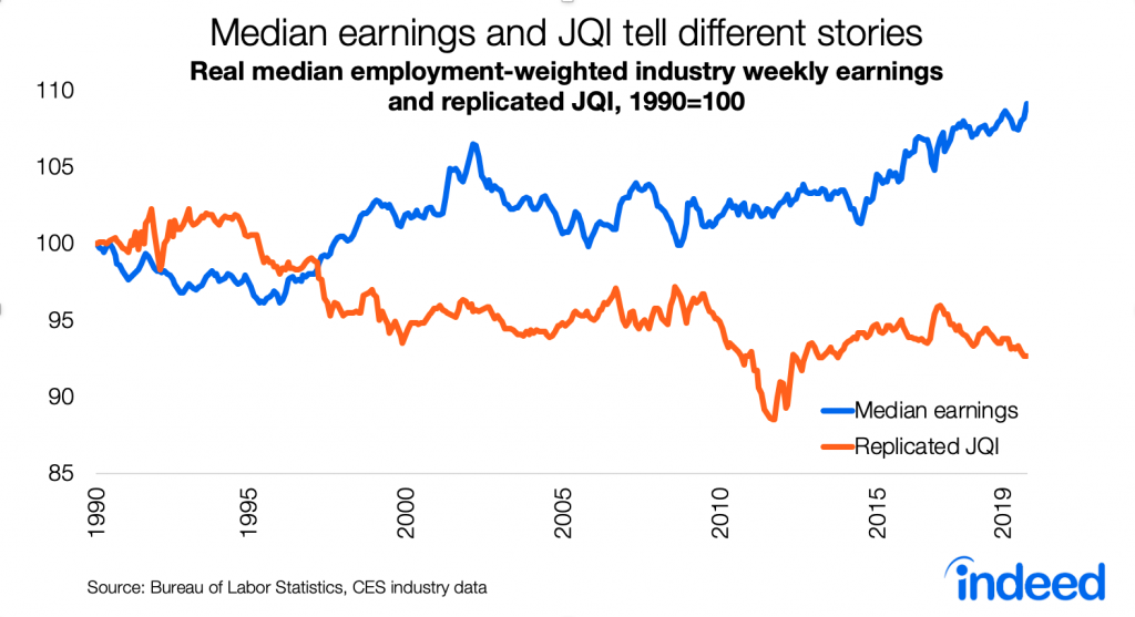
Real median weekly earnings fell during much of the 1990s, rose dramatically in the late 1990s and early 2000s, followed by a long period of stagnation from 2003 to 2015. (Remember that both median earnings and the JQI reflect the composition, not just the quantity, of jobs in the labor market.) Then, with the recent continued tightening of the labor market, median weekly earnings rose steadily starting in 2015 and is now at the highest point of the series. This index was 9% higher in 2019 than in 1990. Median job quality has improved, not fallen, both in recent years and longer term.
What about those struggling in the labor market? The longer-term trend in weekly earnings is less rosy at the bottom of the distribution but still clearly positive in recent years. Weekly earnings at the 25th percentile improved from a low in 2014, though only back to their 1990s level. They remain below where they were throughout the 2000s. The story is better at the 10th percentile, where weekly earnings are now just slightly below their highest point in the series, after falling in the 2000s and climbing back up since 2010.

Reconciling the JQI with the trends in weekly earnings
Why do straightforward trends in weekly earnings tell such a different story than the Job Quality Index? Remember that the JQI is an index of skewness. As noted above, the JQI could fall if weekly earnings in the lowest-earning industries grew strongly. Right now, that’s what’s happening. Weekly earnings have been rising overall and even more steeply in the lowest-earnings industries. Since the start of 2017, real weekly earnings are up 2% at the median and a whopping 7% at the 10th percentile — which is great news for job quality.
Furthermore, the JQI is out of step with other measures of job quality. The New Hires Quality Index from the Upjohn Institute tracks wages for new hires based on occupations — it has been rising since 2015 and is near its record high since the series began in 2001. And Gallup reports that the share of people who think now is a good time to find a quality job is also near a high point since they started asking in 2001.
A broader view of job quality
The trend in median weekly earnings shows a strong and improving labor market, but job quality isn’t only about earnings. An ideal job-quality index would reflect benefits, too, as well as the nature of the work, terms of employment and job security, health and safety, work-life balance, and how much say or representation workers have. However, few of these elements are measured consistently over time. Even if these trend data existed, it would be challenging to combine them into an index because different types of people might define job quality differently.
The JQI does serve as a necessary reminder that the 50-year-record-low headline unemployment rate overstates the health of the labor market. Broader measures of employment aren’t back to their pre-2000 levels. Many workers are stuck with second-class contractor status, unpredictable schedules, and non-compete agreements. Jobs with benefits are rarer than they used to be, especially for workers without a college degree. Mobility and dynamism are in long-term decline. Automation threatens some jobs, and labor-market polarization may worsen. The richest cities are getting richer while other places suffer job losses. Relative to other OECD countries, the US is in the middle of the pack on some job quality measures and below the midpoint on others. But these very real concerns are outside the scope of what the JQI — or any index based on wages, earnings, or incomes — actually measures.
Notes:
The original analysis, replication, and simulations in this post use the same data source as the JQI: BLS series IDs CESxxxxxxxx06 for employment and CESxxxxxxxx30 for average weekly earnings, where xxxxxxxx is the industry code. These are seasonally adjusted series for production and non-supervisory workers. The 175 industries listed in the November 2019 JQI report are included. I replicated the preliminary JQI, which does not adjust for “flip” categories.
Skewness is not the same as variance, which is often used to measure inequality or polarization. Variance is the second moment of a distribution; skewness is the third moment.
This post expands on my Twitter thread from several weeks ago.