Local population growth trends are reverting to pre-2000 patterns as the housing bubble and its aftermath recede.
Today the Census Bureau released its 2015 population estimates for counties and metropolitan areas. After volatile swings in growth patterns during last decade’s housing bubble and bust, long-term trends are reasserting themselves. Population is growing faster in the South and West than in the Northeast and Midwest, and faster in suburban areas than in urban counties; both of these trends accelerated in 2015. Before getting deeper into these broad patterns, though, let’s start with the metros that saw the fastest growth and steepest declines in the past year.
Top Metro Winners and Losers
The Villages – a small metropolitan area near Orlando with lots of retirees – led all metros in population growth. Six of the ten fastest growing metros in 2015 were in Florida and Texas, while none were in the Midwest or Northeast.
| Metros with the Fastest Population Growth | ||
| # | Metro | YoY population change, 2014-2015 |
| 1 | The Villages, FL | 4.3% |
| 2 | Myrtle Beach-Conway-North Myrtle Beach, SC-NC | 3.5% |
| 3 | Cape Coral-Fort Myers, FL | 3.3% |
| 4 | Midland, TX | 3.3% |
| 5 | Odessa, TX | 3.3% |
| 6 | Greeley, CO | 3.2% |
| 7 | Austin-Round Rock, TX | 3.0% |
| 8 | Bend-Redmond, OR | 2.9% |
| 9 | Punta Gorda, FL | 2.8% |
| 10 | Fort Collins, CO | 2.7% |
| Among all metropolitan areas | ||
Among large metros, Cape Coral – Fort Myers and Austin had the fastest growth. All of the fastest-growing large metros were in the South and West.
| Large Metros with the Fastest Population Growth | ||
| # | Metro | YoY population change, 2014-2015 |
| 1 | Cape Coral-Fort Myers, FL | 3.3% |
| 2 | Austin-Round Rock, TX | 3.0% |
| 3 | North Port-Sarasota-Bradenton, FL | 2.7% |
| 4 | Orlando-Kissimmee-Sanford, FL | 2.6% |
| 5 | Raleigh, NC | 2.5% |
| 6 | Houston-The Woodlands-Sugar Land, TX | 2.4% |
| 7 | Charleston-North Charleston, SC | 2.4% |
| 8 | Provo-Orem, UT | 2.4% |
| 9 | Lakeland-Winter Haven, FL | 2.3% |
| 10 | Las Vegas-Henderson-Paradise, NV | 2.2% |
| Among metropolitan areas with at least 500,000 people | ||
Population growth in these metros was driven more by domestic migration than by international migration or “natural increase” (that is, births and deaths). All ten of the fastest-growing large metros had more in-migrants from the rest of the country than out-migrants. However, natural increase boosted population growth in metros with lots of young adults of child-bearing age (e.g. Provo-Orem UT) but was a drag on growth in metros with older populations (such as Cape Coral – Fort Myers and North Port – Sarasota – Bradenton). And among the large metros with the highest growth rate from international migration (Miami, San Jose, New York, Honolulu, Orlando, and Washington DC), only Orlando also had positive net domestic migration and therefore strong overall population growth. (Among all metros, the correlation between overall population growth and net domestic migration was 0.86; the correlation between overall population growth and natural increase was 0.40, and the correlation between overall population growth and international migration was just 0.19.)
Note the presence of oil towns on these lists. Houston was among the ten fastest growing large metros, and Midland and Odessa, TX, were among the fastest growing of all metros. Two other places with an energy boom – Williston and Dickinson, ND, were the fastest-growing “micropolitan” areas in the country. These Census population estimates are as of July 1 of each year, so the 2015 data are actually a snapshot from almost nine months ago. It’s highly likely that population growth has slowed in energy-producing areas since July 2015: more recent jobs data have shown that falling oil prices hurt energy-sector employment.
One last point about the fastest-growing metros: 2015 is the first year since 2010 when Austin was not in the top spot among large metros. Cape Coral – Fort Myers, which bumped Austin out in 2015, was also the leader in the bubble years of 2004-2006.
| Metro with the Fastest Population Growth, by Year | |
| Year | Metro |
| 2001 | Las Vegas-Henderson-Paradise, NV |
| 2002 | Las Vegas-Henderson-Paradise, NV |
| 2003 | Las Vegas-Henderson-Paradise, NV |
| 2004 | Cape Coral-Fort Myers, FL |
| 2005 | Cape Coral-Fort Myers, FL |
| 2006 | Cape Coral-Fort Myers, FL |
| 2007 | New Orleans-Metairie, LA |
| 2008 | Raleigh, NC |
| 2009 | Provo-Orem, UT |
| 2010 | Colorado Springs, CO |
| 2011 | Austin-Round Rock, TX |
| 2012 | Austin-Round Rock, TX |
| 2013 | Austin-Round Rock, TX |
| 2014 | Austin-Round Rock, TX |
| 2015 | Cape Coral-Fort Myers, FL |
| Among metropolitan areas with at least 500,000 people | |
Now for the other extreme. Of the 381 metropolitan areas, 96 lost population in 2015 while 285 gained. Those with the steepest declines were all smaller metros, including several with military bases, spanning most regions of the country except the far West.
| Metros with the Steepest Population Decline | ||
| # | Metro | YoY population change, 2014-2015 |
| 1 | Farmington, NM | -4.2% |
| 2 | Hinesville, GA | -2.6% |
| 3 | Elizabethtown-Fort Knox, KY | -2.2% |
| 4 | Pine Bluff, AR | -1.1% |
| 5 | Watertown-Fort Drum, NY | -1.1% |
| 6 | Decatur, IL | -1.0% |
| 7 | Charleston, WV | -1.0% |
| 8 | Albany, GA | -1.0% |
| 9 | Saginaw, MI | -0.9% |
| 10 | Wichita Falls, TX | -0.9% |
| Among all metropolitan areas | ||
Among larger metros, 13 lost population in 2015 while 91 gained. The ten with the steepest declines were all in Ohio, Pennsylvania, upstate New York, and Connecticut.
| Large Metros with the Steepest Population Declines | ||
| # | Metro | YoY population change, 2014-2015 |
| 1 | Youngstown-Warren-Boardman, OH-PA | -0.7% |
| 2 | Scranton–Wilkes-Barre–Hazleton, PA | -0.3% |
| 3 | Pittsburgh, PA | -0.2% |
| 4 | New Haven-Milford, CT | -0.2% |
| 5 | Syracuse, NY | -0.2% |
| 6 | Rochester, NY | -0.2% |
| 7 | Cleveland-Elyria, OH | -0.2% |
| 8 | Hartford-West Hartford-East Hartford, CT | -0.2% |
| 9 | Toledo, OH | -0.1% |
| 10 | Buffalo-Cheektowaga-Niagara Falls, NY | -0.1% |
| Among metropolitan areas with at least 500,000 people | ||
Youngstown had the sharpest losses among large metros for the past six years and for 11 of the past 15 years. Metro Detroit had the biggest losses in 2008 and 2009; in 2015 Detroit was 14th from the bottom among large metros, with a growth rate of just 0.01%. New Orleans had the steepest population decline of all large metros in 2006 thanks to Hurricane Katrina (the 2006 data reflects the year leading up to July 1, 2006, which includes when Katrina hit in August 2005). The early 2000s tech bust put San Jose at the bottom in 2002.
| Metro with the Steepest Population Decline, by Year | |
| Year | Metro |
| 2001 | Youngstown-Warren-Boardman, OH-PA |
| 2002 | San Jose-Sunnyvale-Santa Clara, CA |
| 2003 | Youngstown-Warren-Boardman, OH-PA |
| 2004 | Youngstown-Warren-Boardman, OH-PA |
| 2005 | Youngstown-Warren-Boardman, OH-PA |
| 2006 | New Orleans-Metairie, LA |
| 2007 | Youngstown-Warren-Boardman, OH-PA |
| 2008 | Detroit-Warren-Dearborn, MI |
| 2009 | Detroit-Warren-Dearborn, MI |
| 2010 | Youngstown-Warren-Boardman, OH-PA |
| 2011 | Youngstown-Warren-Boardman, OH-PA |
| 2012 | Youngstown-Warren-Boardman, OH-PA |
| 2013 | Youngstown-Warren-Boardman, OH-PA |
| 2014 | Youngstown-Warren-Boardman, OH-PA |
| 2015 | Youngstown-Warren-Boardman, OH-PA |
| Among metropolitan areas with at least 500,000 people | |
Population Trends Favor the Sunbelt and the Suburbs
The lists of the fastest and slowing growing metros hint at general patterns in recent population growth. Looking at all counties in the U.S. – not just those in metropolitan areas – reveals three trends.
The first is the accelerating shift of population toward the Sunbelt. Among the four Census regions, the South and West both had population growth of 1.2% in 2015, far ahead of the 0.2% growth in both the Northeast and Midwest. Population growth in the South and West has outpaced that in the Northeast and the Midwest for decades, as well as in each year since 2000 throughout the housing bubble, bust, and recovery. The gap narrowed somewhat after the bubble burst, as population growth quickened in the Northeast between 2008 and 2012. Since 2013, however, population growth in the South and West has accelerated, while growth in the Northeast and Midwest has slowed – thus widening the gap between those two Sunbelt regions and the rest of the country.

The second trend is the recent slowdown in population growth in urban counties (defined as those with tract-weighted density of at least 2000 households per square mile). Both higher-density suburban counties and lower-density suburban counties had faster population growth than urban counties in 2015, and the gap between suburban and urban county growth was larger in 2015 than in 2014. In short, suburbanization accelerated in 2015.
While population growth in urban counties has clearly recovered from the housing bubble, during which urban counties lagged for many years and even lost population in 2006, the rebound in urban population growth was brief. Urban counties outpaced all other areas only in 2011, and urban growth in 2015 slowed to its lowest level since 2007.
Growth in small towns & rural areas – the lowest-density counties – remained behind that of urban, higher-density suburban, and lower-density suburban counties in 2015, even though small towns & rural areas grew in 2015 at the fastest pace since 2010.
Keep in mind that many counties, especially large counties, include both urban and suburban neighborhoods. The Census will release sub-county population estimates for 2015 later this year. Other data sources with greater geographic detail confirm that population growth is generally faster in suburban than urban neighborhoods, though not uniformly: for instance, high-density downtowns have grown faster than moderately dense suburban neighborhoods though slower than the lowest-density suburbs.

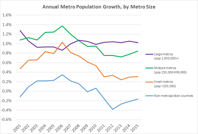
The third trend is that metropolitan areas with at least one million people grew faster in 2015 than midsize and smaller metros did, just as in every year since 2008. While this is a reversal of the bubble years in the early 2000s, when midsize metros grew faster, it is a return to the pre-bubble pattern: in the 1980s and 1990s, as in the post-2008 period, population growth was faster in million-plus metros than in midsize metros, smaller metros, and non-metropolitan areas. (Micropolitan areas counted as metros in this analysis.)
It might seem surprising that urban counties are growing more slowly than suburban counties even though larger metros are outpacing smaller metros: after all, the most urban counties in America are in the large metropolitan areas of New York, Boston, Washington DC, and San Francisco. In fact, though, there’s no contradiction. Even the largest metropolitan areas typically include both urban and suburban counties. Most of the fastest-growing counties in America are suburbs in large Sunbelt metropolitan areas. Of the six counties (among those with at least 50,000 people) where population grew at least 4% in 2015, five are suburbs of large Sunbelt metros: Hays county (in Austin metro), Broomfield (Denver), Comal (San Antonio), Fort Bend (Houston), and Forsyth (Atlanta). (The sixth is Sumter FL, the county that constitutes The Villages metropolitan area.)
The Longer View: Population Trends Are Getting Back to Old Patterns
Since 2000 population trends have reflected the housing boom, bust, and recovery. The boom, lasting until 2006, favored the suburbs, where most new single-family homes were built (or overbuilt). Then, in the housing bust, patterns reversed, with urban counties and large metros rebounding while suburban and rural growth slowed. Now, as the recovery continues, old patterns – from before the 2000s – are returning.
For starters, compare population growth in metros by the severity of their local housing bust. In the hardest-hit metros, where prices climbed during the bubble and then fell 30% or more, population growth slowed dramatically from 2006 to 2009. Note that population in these metros started to slow before the bubble reached its height in 2006, as rising prices hurt affordability, and continued when the bubble burst as people lost their homes and local job markets suffered. In contrast, in metros with a relatively mild housing bust (price declines of 15% or less), population growth accelerated in 2007-2009: their economies held up better in the recession than the hardest-hit metros did. But since 2011, the metros with the severest housing bust have once again had the fastest population growth, and their lead over metros that had a moderate or mild bust has grown. Lower housing prices and stabilized local economies have attracted people back to metros that suffered the worst. In five of the ten large metros with the fastest population growth in 2015 (the four Florida metros plus Las Vegas, as shown above) home prices fell more than 45% in the housing bust.

But it’s not just that population growth patterns today more like they did during early years of the bubble. Rather, local population growth trends increasingly look like they did before the bubble, in the 1980s and 1990s.
To see this, compare the list of the ten fastest-growing large metros in 2015 (shown at the top of this post) with the ten fastest-growing metros over the twenty-year period from 1980 to 2000. Five of the top ten in 2015 were also in the top ten in 1980-2000, including Cape Coral – Fort Myers, Austin, Orlando, Raleigh, and Las Vegas. Another four of the top ten in 2015 were in the top third in 1980-2000: North Port – Sarasota – Bradenton, Houston, Provo – Orem, and Lakeland – Winter Haven. Only Charleston SC was in the top ten in 2015 but had just middling growth from 1980 to 2000. On the flip side, seven of the ten steepest declining metros in 2015 were also among the bottom ten in 1980-2000; the other three in the bottom ten in 2015 were in the bottom twenty in 1980-2000.
Put another way: the correlation between population growth in 2015 and in the 1980-2000 period is quite high. Using all counties, rather than just large metros, the correlation between 2015 growth and 1980-2000 growth was 0.68. What’s surprising is not just that the correlation is high, but that it has increased in recent years: the correlation between 2009 growth and 1980-2000 growth was just 0.47, for example. In general, we’d expect these correlations with the 1980-2000 period to decline with each passing year – in most ways, things today are more like things were one year ago than five, ten, twenty, or fifty years ago. And, until 2009, the correlation between current-year growth and 1980-2000 fell as expected (except in 2006). But since 2009, the correlation has gone up, which is to say that local population growth patterns now look increasingly like the pre-bubble period of 1980-2000.

As local population patterns look more like the pre-bubble period, with accelerating growth in the suburbs and the Sunbelt, it becomes clearer that some of the population shifts during the housing bubble and bust were temporary and reflected the extreme housing cycle. In particular, the acceleration of population growth in the Northeast in 2009-2011 and moment when urban growth surpassed suburban growth in 2011 look like reactions to a housing bubble that brought unsustainable growth to the suburbs and the Sunbelt. That’s not to say that nothing has changed: there have been dramatic shifts since the pre-bubble years in the composition of local populations. College-educated young adults are much more likely to live in high-density urban neighborhoods than they used to, while seniors are increasingly likely to remain in suburban single-family homes. But, in aggregate, local population growth in 2015 looks ever more like it used to before the housing bubble, with the Sunbelt and the suburbs widening their leads.
Notes: all population data are from the Census Bureau. Metropolitan areas consist of one or more counties; the latest Census population estimates and all historical analyses in this post use consistent metropolitan area definitions from 2013, listed here. All population cutoffs are based on 2010 decennial population. There are 917 metropolitan and micropolitan areas altogether, of which 381 are metropolitan areas. There are 104 metropolitan areas that meet the 500,000 population threshold used throughout this post.