City Limits: How Real is the Urban Jobs Comeback?

Last week, General Electric announced it will move its headquarters from Fairfield County CT to downtown Boston. GE is not alone: it joins other companies that have added jobs in big-city locations. Are these examples part of a larger trend of the urbanization of economic activity?

Key evidence in favor is that since 2007 job growth in large metropolitan areas has strongly outpaced job growth in the rest of the U.S. However, a more nuanced story emerges with a closer look at the data. In this post I look at urban versus suburban counties within large metropolitan areas, and at multiple time periods. Overall, while non-metropolitan areas have suffered, and the urban core of metropolitan areas have rebounded in recent years, the long-term trend remains that suburbs of large metros have the fastest job growth.

Suburbs are Where the Job Growth Is

Large metropolitan areas – those with at least a million people — are home to a majority (58%) of all U.S. jobs and are hardly uniform. Some metropolitan areas are far more urban than others: the density of the typical neighborhood in metro Chicago is 6 times that in metro Charlotte. Therefore, job growth in Chicago would be better evidence of an urban comeback than job growth in Charlotte. Also, large metropolitan areas include both dense urban neighborhoods as well as sprawling suburbs: the New York metropolitan area, for instance, includes Pike County PA and Putnam County NY, where the typical resident lives at a density of more than 2 acres per household. So, job growth in Manhattan would be better evidence of an urban comeback than in Pike County.

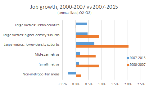
It turns out that job growth in the suburban portions of large metropolitan areas has been faster than in their urban portions. I divided all counties in large metropolitan areas into three categories based on their tract-weighted household density: urban counties, higher-density suburbs, and lower-density suburbs (see notes at the end of this post for details about data and methodology). Of the 58% of U.S. jobs in large metropolitan areas in 2015 Q2, approximately 46% are in urban counties; 38% in higher-density suburban counties; and 16% in lower-density suburban counties. Here’s the comparison of job growth from 2007 Q2 to 2015 Q2 in each type of large-metropolitan counties, alongside mid-size and small metropolitan areas and the non-metropolitan remainder of the country:

jobs 2007 2015

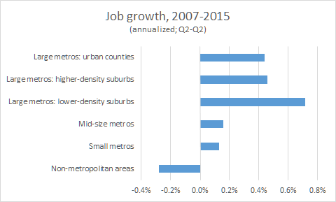
Job growth in all parts of large metros significantly outpaced job growth in smaller and non-metropolitan areas, as noted at the start of this blogpost. But within large metropolitan areas, job growth was fastest in lower-density suburban counties, and slightly faster in the higher-density suburban counties than in urban counties. Therefore, suburbs of large metros have led job growth in the economic recovery.

Take the Long View

The 21st century has begun with an extreme economic cycle. The housing bubble formed in the early years and peaked in 2006, after which home prices plummeted, employment declined, and the economy fell into the Great Recession, followed by the recent years of recovery. The housing bust, recession, and recovery were a reaction and correction to the bubble.

Using 2006 or 2007 as a starting point to compare urban and suburban growth shows us only what happened in the recession and recovery. It ignores the first half of the cycle, when the bubble fueled rapid homebuilding, population growth, and job growth in the suburbs, especially outlying, lower-density suburbs.

Comparing 2007-2015 with 2000-2007, urban counties of large metros win the most-improved award. They alone had faster job growth in 2007-2015 than in 2000-2007, when their job growth was flat. In that sense, the recession and recovery have brought a rebound in urban job growth.

jobs 2000 2007 2015

For evidence of a longer-term, structural – not cyclical — shift in the location of jobs, we need to look at the entire cycle to date, 2000-2015. It’s clear that job growth in this economic cycle as a whole has not been driven by the urban counties of large metros. The fastest job growth by far been in lower-density suburban counties of large metros. Growth in urban counties of large metros has lagged not only other parts of large metros but also mid-size and small metros.

jobs 2000 2015

Another way to look for long-term, structural shifts is to compare 2000-2015 with an earlier period. Comparable data are available starting in 1981. Using the same geographic definitions, this chart compares job growth in the 21st century so far with the last two decades of the 20th:

jobs 1981 2000 2015

Though job growth since 2000 has slowed in all types of places compared with previous decades, the patterns across place types are similar. Urban counties of large metros grew more slowly than suburbs of large metros, mid-size metros, and smaller metros, in both 1981-2000 and 2000-2015. This table shows the same data, along with the difference in growth between the periods:

Job Growth, Difference Between 2000-2015 and 1981-2000

Job Growth, 2000-2015

Job Growth, 1981-2000

Difference, 2000-2015 vs. 1981-2000

Large metros: urban counties

0.2%

1.2%

-1.0%

Large metros: higher-density suburbs

0.7%

2.6%

-2.0%

Large metros: lower-density suburbs

1.3%

3.2%

-1.9%

Mid-size metros

0.4%

2.0%

-1.6%

Small metros

0.5%

2.0%

-1.6%

Non-metropolitan areas

0.0%

1.6%

-1.6%

Note: numbers were rounded after differencing.

The slowdown in job growth between 1981-2000 and 2000-2015 was mildest in urban counties of large metros, and steepest in both higher- and lower-density suburbs of large-metros. In that sense, the suburbanization of jobs within large metro has slowed between 1981-2000 and 2000-2015. But that’s a narrowing, not a reversal, of the longer-term trend of suburbanization. Job growth in urban counties of large metros continued to lag all other place types except non-metropolitan areas since 2000.

Looking Forward

Two pieces of evidence point to a possibly rosier future for urban job growth. The first is that the most recent year of data available – 2014 Q2 to 2015 Q2 – shows that urban counties in large metros were only slightly behind suburban counties in large metros: the gap was narrower than any other year in decades.

jobs 2014 2015

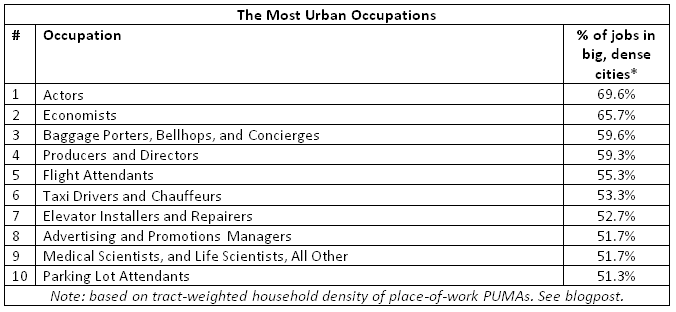
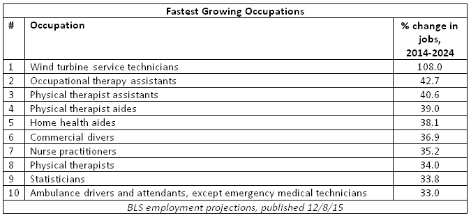
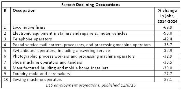
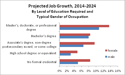
Second, changes in the structure of the American economy favor big cities. The occupations that the Bureau of Labor Statistics expects to grow most over the next decade are disproportionately concentrated in big, dense cities. That’s no guarantee of faster growth, of course, especially if commercial and residential construction fails to keep up with growing demand from businesses that want to be in cities and their employees who want to live there. Still, these occupational changes reflect deeper shifts in economic activity that should favor big cities.

Aside from these nascent indicators, though, it’s hard to make the case that economic activity has fundamentally become more urban. Although urban counties of large metros have bounced back in the recovery, any trends that look at only part of the cycle since 2000 should be presumed cyclical until proven structural, rather than the other way around. Looking over the full cycle in order to see the longer-term trends, the most striking change is the slowdown in job growth in non-metropolitan areas, where growth was slower than in all other places. The fastest job growth in 2000-2015 has been in the lower-density suburbs of large metros – as it was in the two previous decades and, surprisingly, even in the post-2007 correction to the suburban boom of the bubble years. While large metropolitan areas have led the recent economic recovery, it’s a step too far to conclude that America’s economy is in the midst of a broad, fundamental shift away from suburbs toward urban areas.


Notes:

All data in this post are from the Bureau of Labor Statistics’ (BLS) Quarterly Census of Employment and Wages (QCEW). Data for 2000-2015 use the NAICS-classification totals for all covered employment, and data for 1981-2000 use the SIC-classification totals. 1981 is the first year for which comprehensive data are available for U.S. counties: the series begins in 1975, but data for some large counties are missing in the earliest years.

The classification into large, mid-size, small, and non-metropolitan areas follows the approach of Josh Lehner of the Oregon Office of Economic Analysis, published in City Observatory. Josh generously shared his data and methodology with me, which I was able to replicate exactly with the original QCEW data downloaded from the BLS site.

Metropolitan areas are defined as of 2013 and classified by their 2010 Census population into large (1,000,000+), mid-size (250,000-999,999), small (<250,000), and non-metropolitan. Metropolitan areas are defined by the Office of Management and Budget and consist of one or more counties.

I classified counties of large metropolitan areas based on tract-weighted density of households per square mile, as of the 2010 Census, into urban (2000+); higher-density suburban (1000-2000); and lower-density suburban (<1000). Tract-weighted density equals the average density of the Census tracts in a county, weighted by tract households; compared with a standard density measure, it is less skewed by large areas of uninhabited land. I used the same county-density classification in this post about population growth. Tract-weighted household density of 2000 is close to the level that survey respondents consider urban, as explained in this post.

As mentioned, the metropolitan and county-density classifications are based on 2010 population, 2010 household density, and 2013 metropolitan area definitions, for all time periods of employment and wage data shown. However, county density and metropolitan population are affected by earlier changes in employment, potentially introducing bias; as a check, I repeated the analysis for the full 2000-2015 period with an alternative county/metro classification based on year-2000 population, household density, and metropolitan definitions. Results were essentially unchanged, though 2000-2015 employment growth in year-2000-defined non-metropolitan areas was flat instead of slightly negative as shown in the post.

An alternative approach used in other studies (here and here) compares job growth downtown (within three miles of the central business district) with the remainder of the metropolitan area. This approach does not take inter-metropolitan variation in density into account. Despite these methodological differences from the approach in this blogpost, the results are similar. Those studies show that downtowns grew more slowly than the metropolitan remainder when both the bubble years and recession & recovery years are included; downtown growth outpaced metropolitan-remainder growth in the recession & recovery after lagging by a wider margin during the bubble.

Where the Fast-Growing Jobs Are

Urban occupations will grow faster over the next ten years than suburban and rural occupations. The metros with most favorable job mix for growth are Durham-Chapel Hill, New Haven, and San Jose.

The ups and downs of local job and housing markets are often tied to the fates of their key industries. Whether it’s tech in the Bay Area, oil in Houston, or manufacturing across much of the Midwest, the local job mix matters.

Yesterday the Bureau of Labor Statistics released its ten-year projections for occupational growth. This post shows which occupations are projected to grow or decline most; it also demonstrates the profound effect aging will have on labor demand and labor supply, and how the projections are good news for women and the well-educated. Healthcare-related occupations, along with personal care and computer & mathematical occupations, will grow fastest, while production (i.e. manufacturing) and farming/forestry/fishing occupations are projected to decline.

Which local markets are favored with fast-growing occupations or saddled with declining ones? I combined BLS national occupational projections for 2014-2024 with Census data on where occupations are located today, based on place of work (see note).

Urban Jobs, Rural Jobs

What do artists and economists have in common? Not much — aside from being the two most urban occupations. More than 60% of both actors and economists are in big, dense cities. But the most urban occupations also include in-person services where local demand is strongest in big cities, like taxi drivers, parking-lot attendants, and elevator installers and repairers.

most urban occupations

Occupations concentrated in urban areas are projected to grow faster than occupations in other areas. Based on where occupations are located today, urban jobs are projected to grow 6.8% over the next ten years, modestly ahead of suburbs, smaller cities, and rural areas. Rural jobs are disproportionately in manufacturing and natural-resource occupations, which are projected to decline. (This chart shows the weighted average of projected occupational growth in 2014-2014, weighted by today’s occupational mix in each type of area.)

densegroup projections

The differences in overall projected occupational growth across areas aren’t huge, and that’s because only some occupations tend to be clustered in certain areas. Many large occupations, like secretaries, cashiers, elementary school teachers, and retail salespeople, are almost everywhere, so the occupational mix varies less across different locations that you might think.

Still, growth in occupations that don’t just serve the local population — like software developers or petroleum engineers — tends to boost growth in other occupations that do service the local population. For instance, if tech is booming and the oil industry is shrinking, then growth in other occupations catering to tech and oil workers — such as retail and personal services — could be faster in tech-heavy San Jose than in oil-dependent Houston. (Economists call this “local multipliers.”) Therefore, the projected differences across areas in occupational growth, shown above, probably understate the important of job mix to local growth.

The Local Markets with the Fastest-Growing Occupations

The same method shows which local markets have the most and least favorable job mixes. Among all metropolitan areas with at least half a million people, Durham-Chapel Hill, NC, has the most favorable job mix for future growth, followed by New Haven and San Jose. Several of these top ten have large local tech industries, including Durham-Chapel Hill, San Jose, Boston, and Washington, DC. Many are among America’s most expensive markets. What accounts for McAllen-Edinburg-Mission, a large, low-income Texas border metro? There, many people work in the growing occupations of home health and personal care, and relatively few in declining routine office occupations.

metros most favorable

The inland California metros of Bakersfield, Fresno, and Stockton have the least favorable mix. These metros have young populations and therefore relatively few people in healthcare jobs; furthermore, they have substantial agricultural industries, and Bakersfield has a significant oil and gas industry as well. Largely absent from this list are Midwestern markets, despite their historical reliance on manufacturing.

metros least favorable

The differences between metros are very small. Large metros aren’t as different in their occupational mix as you might think. Plus, remember that this approach might understate the impact of job mix on local growth because of the assumption that any given occupation will grow at the same rate in all places; that is, this approach ignores any multiplier effect.

But job mix isn’t necessarily local destiny. People move not only for jobs but also for personal reasons and for housing affordability. Places where geography or regulations (or both) limit new housing construction could have slower job growth than predicted by their job mix: failing to accommodate booming local industries with more housing could lead to higher housing prices rather than faster job growth. Other state and local policies, too, could also boost or constrain growth relative to what the job mix alone would predict. And places that aging baby boomers eventually move to could see larger-than-expected growth in healthcare jobs and other services that retirees consume.

Still, a local area’s job mix is a tailwind or headwind for future growth. Some fast-growing occupations are clustered in particular places, as are some fast-declining industries. Whether the occupations and industries that lead U.S. economic growth are as predicted or are full of surprises, the local job mix will be a blessing for some markets and a curse for others.

Note: Employment projections are from the Bureau of Labor Statistics (BLS), and the location of workers is from the American Community Survey (ACS). The 818 BLS occupation codes were combined as necessary to match the 473 ACS occupation codes.

Location of workers was based on Place of Work Public Use Microdata Areas (PUMAs), which are aggregations of residential PUMAs and are typically equivalent to counties in more urban areas or groups of counties in more rural areas. Place of Work PUMA’s were classified by tract-weighted household density into big, dense cities (weighted density of 2000+ households per square mile); big-city suburbs and lower-density cities (1000-2000); lower-density suburbs and smaller cities (500-1000); and small towns and rural areas (0-500). Approximately 30% of jobs are in big, dense cities; 30% in big-city suburbs and lower-density cities; 20% in lower-density suburbs and smaller cities; and 20% in small towns and rural areas. Data on the location of workers are from the ACS Public Use Microdata Sample (PUMS), 2012-2014.

ACS data were downloaded from IPUMS, which requests to be cited as: Steven Ruggles, Katie Genadek, Ronald Goeken, Josiah Grover, and Matthew Sobek. Integrated Public Use Microdata Series: Version 6.0 [Machine-readable database]. Minneapolis: University of Minnesota, 2015.

The Jobs and Workers of Tomorrow

The aging of the U.S. population will drive demand for health-care jobs, and nearly one-quarter of the American workforce in ten years will be 55 or older.

The latest employment projections from the Bureau of Labor Statistics reveal the effect of the aging population on both labor demand and labor supply. These projections, updated every two years, were released this morning and provide a comprehensive view of how the labor market might change over the next decade. I’ll be looking at these and related data as part of a new research project with Bloomberg Beta.

The fastest growing and declining occupations

Looking first at occupational groups, the fastest growing are projected to be healthcare support occupations (like nursing assistants and home health aides) and healthcare practitioners and technical occupations (like doctors and nurses). Many high-tech jobs are classified under computer and mathematical occupations, which are projected to grow quickly though not as quickly as the health-related occupations. Production occupations — two-thirds of which are in manufacturing firms — are expected to decline, as are farming, fishery, and forestry occupations.

major occupational group chart

At a more detailed level, the fastest-growing occupations are mostly health-related, led by large increases in physical therapy, occupational therapy, and nursing. Tailwinds are strong for wind turbine service technicians — whose ranks are expected to double — and the numbers are adding up for statisticians, too.

fastest growing occupations

The fastest-declining occupations include many that produce or transport physical goods, including locomotive firers. Plus, modern communication technologies continue to displace mail-processing, telephone, and switchboard operators.

fastest declining occupations

Faster-growing occupations require more education

Alongside its employment projections, the BLS reports the level of education needed to enter each occupation. I combined occupations requiring the same level of education and compared the total projected growth across the groups. The fastest growing are projected to be those needing a master’s, doctorate, or professional degree. Many of the fast-growing healthcare jobs require these advanced degrees. But the slowest-growing occupations aren’t those needing the least education. Rather, occupations requiring a high school degree are projected to grow more slowly than those requiring no formal credential. Occupations requiring a high-school degree accounted for 36% of jobs in 2014 and are important for middle-class opportunity. The slow growth of jobs requiring high school degrees will cause the labor market to continue to polarize into jobs requiring more education and those requiring less.

job growth by education

The fastest-growing occupations have something else in common. Six of the ten fastest-growing occupations — all of the therapy and nursing occupations — are dominated by women. Just three — wind turbine service technicians, commercial divers, and ambulance drivers — are mostly male. (Statisticians are roughly 50/50.) This pattern holds across the full set of jobs: female-majority occupations are projected to grow 7.7% over the next ten years, versus 5.1% for male-majority occupations. (Of course, the sex ratio of occupations could change in the future as well.)

Breaking it down further, by sex and educational requirements, the slowest-growing occupations are projected to be those that require a high school degree and are traditionally male — including many production (i.e. manufacturing) occupations. Employment in those occupations is projected to grow just 3.0% over ten years — less than one-fourth the growth rate of female-majority occupations requiring a master’s, doctorate, or professional degree.

job growth by education and sex

The aging workforce

Just as the aging population will change the types of jobs we’ll need, the workforce itself will age. Two trends will work together to make this happen. First, of course, is that baby boomers will be aging into their 60s and 70s. The number of adults 55+ is projected to increase 21% between 2014 and 2024. In contrast, the number of 25-54 year-olds — the “prime working-age population” — is projected to increase just 4% over the same period, despite the large number of young millennials (age 20-24) moving into prime working age.

Second is that labor force participation is projected to rise most for age groups 55+, especially those 65-74. The BLS projects that the share of 55-64 year-olds who are in the labor force (that is, people who are either employed or unemployed but actively looking for work) will rise from 64.1% in 2014 to 66.3% in 2024. For 65-74 year-olds, the labor force participation rate is projected to rise from 26.2% to 29.9%. In other words, people will be retiring later. In contrast, the BLS expects the labor force participation rate for younger age groups to stay flat or decline.

change in LFPR by age

The combination of faster population growth and rising labor force participation among older adults and means that nearly one-quarter (24.8%) of the workforce in 2024 will be 55+. That’s up from 21.7% in 2014 and just 11.9% twenty years earlier, in 1994. Seniors (65+) will be 8.2% of the labor force in ten years — nearly three times their share of 2.9% twenty years ago.

share of older adults in labor force

These projections reveal the significant impact the aging population will have on labor demand and labor supply. Health-care jobs will grow fastest, and nearly one-quarter of the labor force will be older than prime working-age (a term that might itself need to be retired). More generally, job growth will favor women and those with advanced degrees, while men with high school degrees may face the biggest labor-market challenges.

Note: all data, with the exception of the sex ratio of occupations, are from the Bureau of Labor Statistics. Sex ratio by occupation was calculated from the American Community Survey (ACS) Public Use Microdata Sample (PUMS), 2012-2014. The BLS provides more detailed occupation codes than the ACS, so in some cases the sex ratio for a broader occupation reported in the ACS was assigned to multiple, more detailed occupations reported in the BLS projections. ACS data were downloaded from IPUMS, which requests to be cited as: Steven Ruggles, Katie Genadek, Ronald Goeken, Josiah Grover, and Matthew Sobek. Integrated Public Use Microdata Series: Version 6.0 [Machine-readable database]. Minneapolis: University of Minnesota, 2015.

Why Millennials Still Live With Their Parents

The entire increase in young adults living with their parents over the past twenty years can be explained by demographic shifts. That means the high share of millennials living with parents today might be the new normal.

This morning the Census reported that more young adults are living with their parents in 2015 than during the recession. Despite widespread expectations (including my own) that young people would move out as the job market recovered, they are not. The share of 18-34 year-olds living with parents was 31.5% in 2015, up from 31.4% in 2014. (These Census data are from March of each year. See note at end of post on data and methods.) Using different Census data, Pew recently reported that in 2014 the share of young adults living with parents or relatives was at its highest level since 1940 for men and even earlier for women.

The chart below shows the trend. (The charts in this post differ slightly from the newly published Census tables. See note for why.) After dropping a bit from the late 1990s to the early 2000s, the share of 18-34 year-olds living in their parents’ home rose steadily from 2005 to 2012 and has remained near this post-recession high even as the economy has recovered and unemployment for young adults has dropped sharply.

in parents home 1834 112215

Because the share of young adults living with their parents rose suddenly after the housing bubble of the mid-2000s burst, it’s natural to explain this trend in terms of recent housing and labor market dynamics. After all, young adults with jobs are much less likely to live with their parents than young adults without jobs are. Plus, rising rents and student debt burdens might be holding young people back from moving out of their parents’ homes.

However, alongside recent swings in the housing and job markets, there have been profound long-term demographic shifts that are related to young adults’ living arrangements. For instance, an unusually high share of 18-34 year-olds are at the young end of that range, and younger young adults (18-24) are much more likely to live with parents than older young adults (25-34). An especially important trend is that people are waiting longer today than in the past to get married and have kids — so the share of 18-34 year-olds who are married with kids has plummeted from 49% in 1970 to 36% in 1980, 32% in 1990, 27% in 2000, 22% in 2010, and just 20% in 2015. Unsurprisingly, married young adults and those with children are far less likely to live with their parents than single or childless young adults.

married with kids 1834 112215

How much have these longer-term demographic shifts contributed to the increase in young adults living with their parents? Using regression analysis, I estimated how much these demographic shifts contributed to changes in young adults living with parents in order to extract the demographics-adjusted trend. I included a standard set of demographic variables: five-year age subgroup, marital status, presence of children, sex, race, ethnicity, nativity (i.e. native- or foreign-born), current school enrollment, and educational attainment.

Adjusted for demographic shifts, the share of young adults living in their parents’ home was actually lower in 2015 than in the pre-bubble years of the late 1990s. In other words, young people today are less likely to live with their parents than young people with the same demographics twenty years ago were. To be sure, even the demographics-adjusted share of young adults living with their parents has climbed back up since the housing bubble burst around 2006, but it remains below pre-bubble levels from the 1990s.

in parents home 1834 demographics adjusted 112215

In this kind of analysis it’s important not to explain too much away using demographics, especially if demographic trends might themselves be an effect of living with parents or of the recession. For instance, it’s possible that living with parents might delay marriage: sleeping in your childhood bedroom probably doesn’t help your social life. In fact, though, the decline in young adults being married with kids long pre-dates the recession and the rise in living with parents, and has been relatively steady for decades (see chart above). That means marrying later is not the effect of the post-2005 increase in living with parents.

The other demographic variables we might not want to adjust for are school enrollment (i.e. are you currently in college) or educational attainment (i.e. what’s the highest degree you’ve earned). School enrollment and educational attainment are affected by the economic cycle and affect whether you live with your parents. Plus, the Census counts full-time students in dorms as living with their parents in the data used in this analysis. As a check, I dropped the school enrollment and educational attainment variables and limited the sample to 25-34 year-olds only, few of whom are still in school. The story remains the same: while the demographics-adjusted share of young adults living with parents has increased since the mid-2000s, it remains slightly below the pre-bubble level of the 1990s.

in parents home 2534 demographics adjusted 112215

So that’s the punchline: the increase in young adults living with parents over the past twenty years can be explained entirely by demographic changes. The increase since 2005 is not an aberration; once demographics are taken into account, the aberration is the bubble years of the mid-2000s, when an unusually low share of young adults was living with parents.

Adjusting for demographics doesn’t make the recent increase in young adults living with parents — or the implications for today’s housing market — any less “real.” The increased share of young adults living with parents means that household formation is being driven not by millennials but by baby boomers, and helps explain the low share of first-time home-buyers.

But adjusting for demographics does change what we should expect from the future. Because the demographics-adjusted share of young adults living with parents today is similar to pre-bubble levels, long-term demographic shifts may simply have pushed up the share of young adults living with parents to a new normal. Unless demographic trends reverse, the share of young adults living with parents is unlikely to fall much. Today’s millennials will leave their parents’ homes as they age — they’re not going to live there forever. But it won’t be the sudden unleashing of pent-up demand we might have expected if the increase of living with parents were only about the housing bust and recession and not about longer-term demographic shifts.

Notes:

  • All original data and charts in this post are based on my analysis of the Current Population Survey’s (CPS) Annual Social and Economic Supplement (ASEC). For 2014, when the ASEC used a split sample, I combined the 5/8 and 3/8 samples and weighted them appropriately. The published Census tables on families and living arrangements, available here, are based on the same underlying data but with minor differences in how living at home or with parents is calculated.
  • The pre-bubble years (1994-1999) are the baseline, so the actual and demographics-adjusted shares of young adults living with parents, averaged over those years, are equal by construction. The analysis begins in 1994 because that’s the first year when the complete set of demographic variables is available.
  • I downloaded the CPS-ASEC data from IPUMS, which requests to be cited as: Sarah Flood, Miriam King, Steven Ruggles, and J. Robert Warren. Integrated Public Use Microdata Series, Current Population Survey: Version 4.0. [Machine-readable database]. Minneapolis: University of Minnesota, 2015. 
  • The Pew report cited in the blogpost used data from the American Community Survey and decennial Censuses, which yield different estimates than the CPS-ASEC but the same broad trends.

Bay Area Leads the U.S. in Job Growth

The Bureau of Labor Statistics just posted data on metro-level job growth for October 2015. (Their report on these data, however, won’t be published until December 7.) Two trends stand out.

First: looking at large metros — those with one million or more people — the San Jose and San Francisco areas have the fastest job growth in the country.

fastest oct 2015

Sure, the tech industry is booming, which boosts Bay Area employment. But fast employment growth in San Jose and San Francisco is nonetheless striking because limited housing construction in the Bay Area holds back growth and adds to housing costs. (Last week, the President’s chief economist, Jason Furman, gave a speech on how land use regulations hold back local economies. And this academic paper shows how housing-supply constraints restrict growth in productive cities and hurt national economic growth.)

All of the 10 large metros with the fastest job growth were in the South and West, including several in states that suffered the worst of the housing bust.

The second notable fact is that Houston — after years of fast growth — is now among the slowest-growing large metros, hurt of course by the decline in oil prices.

slowest oct 2015

None of the slowest-growing large metros are in the West, and half are in the Northeast & Midwest.

One last point: Texas has both fast (San Antonio, Dallas, and Austin) and slow (Houston) growing metros. Texas — like other large states — is economically diverse, and it makes little sense to look at job growth, unemployment, or other economic indicators at the state level because it obscures huge differences in economic activity within the state.

Note: data shown are for metro areas and metro divisions (where defined) with one million or more people. These data are from the Bureau of Labor Statistics.