Local differences in COVID19 deaths follow persistent patterns. The strongest predictor of high local death rate is now proximity to New York.
Using the New York Times’s published daily counts of COVID19 cases and deaths by county, I’ve been tracking local differences and analyzing the factors correlated with higher death rates. This blogpost was first published on April 15, 2020, and was updated May 13. The county-level data are available for download at the end of the post, along with data definitions and sources. I will do my best to answer questions emailed through www.jedkolko.com/contact or at @jedkolko.
Metro New York has the nation’s highest death rate. Many of the other metros with the highest death rates are near New York. Seven of the top ten are in the Northeast, and none is west of New Orleans. The death count is almost nine times higher in New York than in Detroit, the metro with the second-highest count nationally.

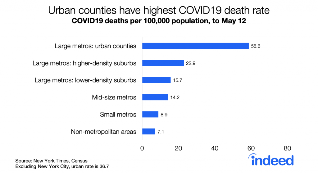
Urban counties have the highest death rates, followed by suburbs, smaller metros, and rural areas. The urban death rate remains significantly higher than in other places even excluding New York City.
Descriptively, higher density counties have higher death rates. The correlation between density and death rates is 0.45. Excluding metro New York, the correlation is 0.26 — lower but still statistically significant. Notably, the correlation between density and per capita death rates has strengthened slightly over the past four weeks as death rates nationally have nearly tripled. While fewer suburban and rural counties are untouched by COVID19 than four weeks ago, death rates remain higher in denser counties and larger metros.

Density is correlated with many factors that have been hypothesized to be a mechanism for COVID19 outbreaks and transmission. A simple regression model helps assess which factors correlated with density are more strongly correlated with local death rates.
I use a model of deaths per capita, by county, weighted by county population, with county variables explained at the end of this post. The table reports standardized betas, with all variables transformed to have a variance of one, along with t-statistics. Metropolitan New York is excluded from these regressions since New York has a very high death rate, is very large and therefore contributes more to the population-weighted regressions, and has extreme values for many variables like density. Using deaths per capita rather than deaths can create problems, but the alternative of regressing counts on counts means that size swamps all other factors and results in meaninglessly high goodness-of-fit.
Column 1 in the regression table below is the baseline model, repeated from the original blogpost but with data through May 12. Death rates are higher in counties with a higher share of older and African-American residents, and in places where March 2020 was colder. Death rates are higher in denser counties and in more populous metros, even when controlling for demographics and weather.

Column 2 adds four variables all positively correlated with density: transit usage, the Gini coefficient measuring household income inequality, average household size, and share of crowded households with more than one person per room. All are positive and meaningfully large except the crowded variable, though even with these included the density and metro size variables remain statistically significant.
Column 3 adds the log of distance from the county to New York City. Its effect is negative, statistically significant, and larger than all other variables when comparing coefficients on a standardized scale. Put simply: the closer a county is to New York City, the higher the death rate, even after controlling for density, metro size, demographics, weather, and other factors.
Column 4 presents the same model as column 3, but for deaths rates four weeks earlier, on April 14 instead of May 12. Strikingly, few variables look different. Even though the national death count was almost three times higher on May 12 than on April 14, the patterns are largely similar. Death rates now, like then, are higher in denser counties in larger metros, with older and more African-American populations, and colder weather.
Two shifts over the past four weeks stand out. First is that death rates have become increasingly correlated with proximity to New York — the standardized coefficient grew in magnitude from -0.15 to -0.42. Second is that these factors explain more of the variation in death rates across counties, with the r-squared rising from 0.23 to 0.44. In that sense, patterns in local death rates are becoming less random as the pandemic proceeds, even though each week brings new outbreaks and hotspots.
Overall the patterns of local death rates has been more continuity than change. Comparing deaths per capita four weeks ago, on April 14, with subsequent deaths per capita in the past four weeks, between April 14 and May 12, the correlation across counties is 0.82, population weighted. That means that the places with higher death rates a month ago have had higher death rates since then.
One other pattern persists. Both death rates and case rates remain higher in Democratic-leaning counties than in Republican-leaning counties, based on the 2016 presidential vote. The gap has narrowed modestly: the death rate was 4.0 times higher in blue counties than red counties on April 7, and 3.3 times higher on May 12. The ratio of case rates in blue counties versus red counties has fallen from 2.8 to 2.4. This persistent partisan gap in death rates probably contributes to the stubbornly partisan politics of physical distancing and stay-at-home orders.

A few closing thoughts. Most of this analysis excludes New York, which is such an extreme case in many ways. The reasons that explain New York’s high death rates appear to be somewhat different from the factors that explain variation in death rates across the country. In fact, research on New York City neighborhoods suggests death rates within the city are higher in lower-density neighborhoods with more residential crowding — the opposite of what we find when comparing countries across the US. Furthermore, outside the US there are many examples of extraordinarily dense cities with low death rates, like Hong Kong. The factors that explain variation in death rates internationally, or among neighborhoods within a city, can differ from those that explain variation across counties or metros within the US.
Here is the dataset (click here) I’ve been using. I’ve included all the variables that are publicly shareable, with case and death counts as of May 12 as published by the New York Times. A few counties around New York City (my own pseudo-FIPS 36991), Kansas City MO (pseudo-FIPS 29991), and Joplin MO (pseudo-FIPS 29992) have been combined in accordance with the NYT readme file. Other variables include:
- CBSAs (metro area), September 2018 definitions.
- Population estimate, July 2019, Census.
- pcases and pdeaths are per-capita case and death rates.
- Density: tract-weighted household density, based on 2010 Census counts.
- Actual temperature and precipitation averages for March 2020, from National Oceanic and Atmospheric Administration.
- Obesity rate, Centers for Disease Control and Prevention.
- Age60plus, black_pct, hisp_pct, and asian_pct are all derived from the 2018 Census population estimates for county characteristics.
- Hospitality jobs and oil jobs are from County Business Patterns 2017. Hospitality includes NAICS 481, 71, and 72. Oil includes NAICS 211, 213111, and 213112. I imputed values for suppressed cells.
- lndistance is the log of distance from the population-weighted county centroid to the population-weighted county centroid of Manhattan
- Several variables are from the Census ACS 2018 5-year tables.
- college is % with bachelor degree or more, table S1501.
- seasonal_units, tables B25002 and B25004.
- wfh_share is the % of county residents working in occupations that can be done from home, based on occupational coding by Dingel and Neiman and table S2401.
- transit_modeshare and wfh_modeshare are the % of county residents who commute by transit or work from home, table B08006.
- italy_born and china_born are the % of county residents born in Italy or China, tables B05002 and B05006.
- gini is the gini coefficient for household income inequality, table B19083
- hhsize is average household size, and crowded is % of households with more than one person per room, table DP04
Here’s the full list of death rates by metro.
In addition, I’m very grateful for data that others have compiled that I’ve used in analysis but have not included in my shared dataset:
- physical distancing, from the GeoDS Lab at UW-Madison
- state and local interventions like stay-at-home orders, from a team at Johns Hopkins University
- county-pair matrix of connections based on mobile-device patterns from PlaceIQ, from a team of academic economists
And thanks to numerous folks for sharing data and ideas, including (but hardly limited to!) @_dmca, @GephenS, @LoriThombs, @TradeDiversion, @jessiehandbury, @bdkilleen, @gissong, and @jm0rt.
Please share any suggestions or corrections via www.jedkolko.com/contact or @jedkolko.