The 2016 presidential election was shocking and unprecedented in countless ways. Newly released county-level vote data reveal an election that was more polarized than any since at least 2000, though on many dimensions voting patterns were a continuation and acceleration of trends already underway, rather than a reversal.
This post focuses on relationships between the county-level vote and geographic and demographic variables, using county vote totals from Dave Leip’s Atlas of U.S. Presidential Elections (version 0.25, updated Thursday evening November 10). Those data are still preliminary and incomplete, may contain errors, and will be revised over the coming weeks. A companion post on FiveThirtyEight takes a deeper look at economic conditions and the 2016 vote.
The key county election variable is the margin, which equals the difference between the Democrat’s vote and the Republican’s vote, divided by the total of votes for all candidates including third-party candidates. All summary measures in this post are weighted by the county’s total vote count.
The 2016 election was the most geographically polarized election since 2000. (This blogpost looks only at election data from 2000, 2004, 2008, 2012, and 2016.) The standard deviation of the vote margin between the Democrat and the Republican was higher in 2016 than in previous years and has been increasing steadily. That means that the vote in a county was, on average, farther in one direction or the other from the national vote in 2016 than in previous years.

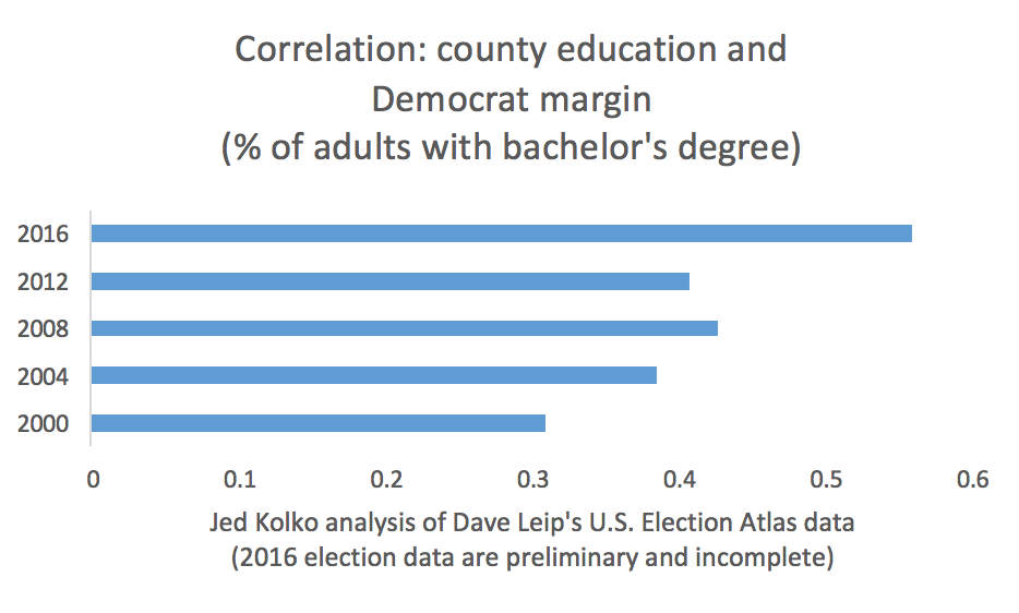
How did the geographic patterns change? Voting aligned more tightly with both race and education in 2016 than in earlier years. The correlation between % of residents who are White (non-Hispanic) and the Republican margin was .69 in 2016; the correlation between % of adults with a bachelor’s degree and the Democrat margin was .56. While the correlation with the vote margin was higher for race than education in 2016, the increase relative to previous years was steeper for education than race.


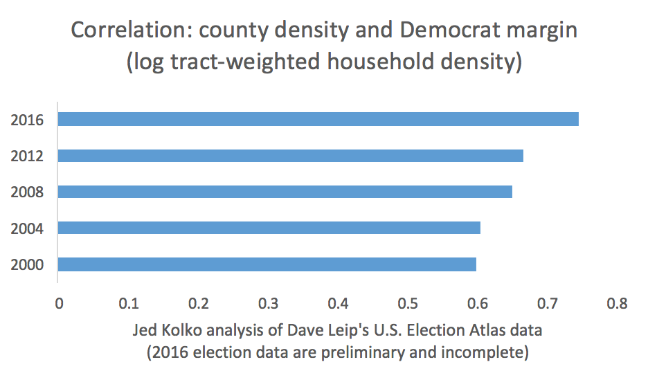
The vote also skewed more strongly by population and density. The correlation between household density per square mile and the Democrat margin was .75, the highest since 2000, and accelerated in 2016. (Household density is a measure of urbanness.)
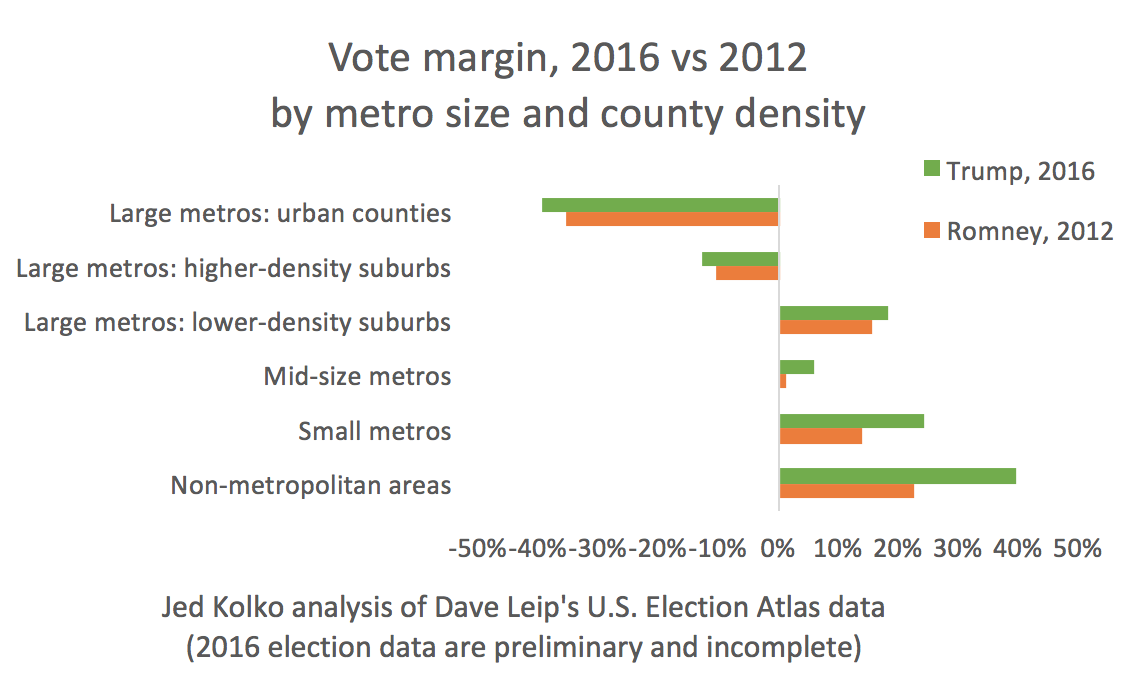
Large metros tend to vote Democrat, while mid-size and small metros as well as non-metropolitan (largely rural) areas tend to vote Republican. Within large metros, however, lower-density suburbs tend to vote Republican. Between 2012 and 2016, the urban counties of large metros inched more toward blue, but small metros and non-metro areas became much more red. (Metro and density are explained in more detail at the end of this post.)

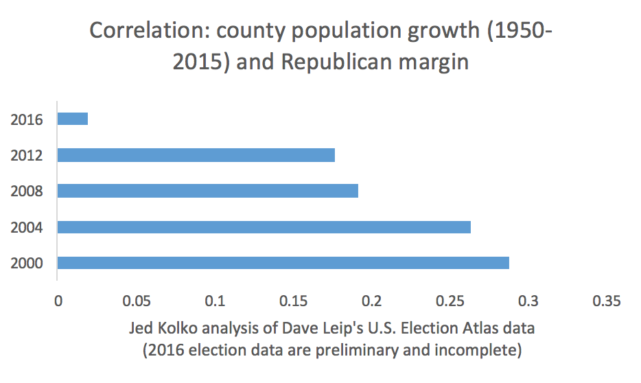
Finally, the counties that swung more Republican in 2016 included many in the Midwest and central parts of the country that face economic challenges including slower growth. Whereas in previous elections counties with faster long-term population growth tended to vote Republican, that relationship essentially disappeared in 2016. This may turn out to be a silver lining for Democrats if more faster-growing counties increasingly lean blue.
Some examples of counties and metros that flipped in 2016 provide color. The largest county that voted for Trump in 2016 after voting blue in 2000, 2004, 2008, and 2012 was Suffolk County, NY (the eastern part of Long Island). Orange County, CA (south of Los Angeles) went the other way, voting for Clinton in 2016 after voting red in previous years. These flips reflect both new political alignments as well as local demographic shifts.
Among metros, the largest to vote for Trump after voting blue in 2000-2012 were St. Louis; Youngstown, OH; Scranton, PA; Erie, PA; and Saginaw, MI. (Trump won the St. Louis metro by just a hair, so it’s possible that could change as additional data come in.) The only metro where Clinton led after voting red in 2000-2012 was Salt Lake City, where independent Evan McMullin got a notable share of the vote.
For the most part, though, blue America remains blue, and red America remains red. The correlation of the 2016 and 2012 margins across all counties was .96, as was the correlation of the 2008 and 2004 margins. (The 2008-2012 and 2000-2004 correlations were even higher, though each of those election pairs featured the same candidate for one of the parties.) Places that voted differently in 2016 than in 2012 or earlier elections are the exceptions. The country is increasingly politically polarized, and on most dimensions the polarization is accelerating. For all the ways in which 2016 was different, the geographic pattern of voting was an exaggeration, not a reversal, of trends already underway.

